The Breadcrumb Slice II is an industrial-grade enclosure for an Apple iPad Air© and a credit card reader, specifically designed for the point-of-sale market in table-service Restaurants. This complete iPad restaurant & bar POS with 200+ features-customizable menus, modifiers, kitchen printing, labor management, and real-time reporting, was an in-house design developed in close collaboration with a small family-run manufacturer in North Carolina and it is an example of the balance of strength and durability alongside a differentiated and beautiful design that is exclusive to the Breadcrumb point of sale solution (http://breadcrumb.groupon.com). We are proud to make the Breadcrumb Slice II 100% in the USA (Read the behind-the-scenes story)
Industrial-grade enclosure for a point of sale in table-service Restaurants. Software + Hardware + Branding + Communication.
Unlike most of Breadcrumb competitors that use quickly aging plastic, or inexpensive flimsy punched-out plates. This solution was designed with CNC-machined 6061 high grade aluminum, ensuring longevity despite the rigors and abuse in a restaurant’s behind-the counter standard placement. The iunit can sustain hits by service trays, full lean-on from staff, and dirt and grime will not permanently mar its surface which is easy to clean with few top-facing gaps or crannies. Unlike alterantives as well, the reader is side-mounted to avoid detritus fallout into the gap. Also unique, is the construction: All our components are modular and if the reader breaks, or if the tablet changes form-factor, Breadcrumb can change and ship a single part (in a simple envelope), not the entire unit. The stands are fully built in North Carolina, so we don’t need to ship from overseas.
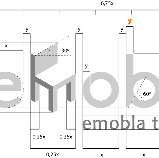
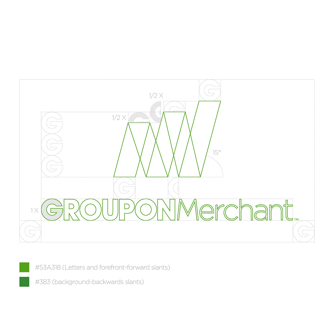
By implementing a design that completely braces the credit card reader, the user can be confident in the knowledge that the act of accepting payments on their device will work reliably and consistently (no wiggle room to create connector stress over time). Even design choices as simple as a two-tone color aesthetic plus a directional logo were conscious choices to help indicate the swiping path of a credit card resulting in greater efficiency - these visual clues clearly show how a credit card should be swiped, thus minimizing errors.
Finally, in an industry where merchants go to great lengths to create an environment that is clean, welcoming and inviting, a beautiful enclosure to match their diligence is important. Even the angle of the screen was carefully considered and is frequently complimented. The stand takes up minimal space, has a great viewing angle and can be counter or wall mounted (simple rotation of face plate by changing four screws) to offer greater choice for the merchant’s subjective implementation.
One of many design challenges that we faced was the credit card reader bracket. In order to maintain an overall appearance of simple elegance yet remain modular and adaptable to multiple third-party options, it was important to match the design of this extension to that of the faceplate while still creating an obvious swipe path for the user. It soon became clear that the bracket covered one of the four screws that fasten the faceplate to the backplate which would have required the user to remove the bracket in order to access them (an extra step in the disassembly of the product). By introducing an angled parallelogram as the form of the side bracket, the issue was resolved with elegance.
We also saw in the field a need to have a structure that could withstand the full leaning weight of a server. With its contra-posto and its high-tensile aluminum construction, waiters can rest with a hand on top of the unit while interacting with its software. The Breadcrumb Slice II still feels solid and steady.
Credit card reader reliability was a key goal. In our industry, these readers are a critical component of the business operation of our customers. Restaurants, bars and quick-service establishments cannot afford to have the means by which they accept payment, fail. And yet, they do so all the time due to stress applied to the connection between tablet and credit card reader attachment (usually annexed via the tablet’s sound port). Another problem plaguing this class of the products is the lack of aesthetic appeal. Basic functionality is often prioritized without an emphasis on creating a product that is both beautiful and memorable within the elegant setting of a restaurant. Many stands in the market today aim to address the need to house an iPad securely without a regard for counter space (a prime consideration for merchants) or the upscale experience of these user experience-focused venues... nor a design that truly embraces the modern vision of using an iPad or tablet to run your point of sale. We did this without compromising durability or ecological and social accountability. The ergonomics also surpasses the competition, with a base featuring an angle and a weight that takes most energetic taps (on any corner of the tablet screen) without any of the rocking or vibration typical on other solutions.
The users are the entire staff (servers, receptionist, manager, owner) of a food & drink venue (restaurant or bar). This type of users have very specific needs that our product prioritizes. Namely: Securing their hardware investment in a multitude of choices (wall-mounted, on a rotating base, bolted to surface), make it reliable and fit for the work-flow behind a counter (Comfortable full-lean-on, and resistant to abuse), and make it easy to clean (powder-coated and few protrusions/crannies).
The product is designed with long duration in mind. Not only the enclosure is made of high grade aluminum that lasts a lifetime of abuse and is easily recycled via our program, but it is also modular to change only parts as third-party component evolve. We also ship from within US borders (all parts made in North Carolina which reduces global carbon footprint in both manufacturing and shipping).
We started concept of Slice 1 in November 2013 and distribution of Slice 1 in Feb 2014
We started concept of Slice 2 in November 2014 and distribution of Slice 2 in Feb 2015
Market locations for both were national distribution (emphasis on NY, Chi and SF)
Distribution out of Redmond, WA
Size and weight of the product:
4.06 lbs
11.40” (W) x 8.44” (H) x 6.62” (D)
Suggested retail price:
MSRP is $199
Materials Used:
The faceplate, backplate, and credit card reader bracket are single pieces made of 6061 aluminum. The base is made of 3003 aluminum. These four parts are powder-coated using two colors (Black BK11 in matte and Yellow PMS 129 U in gloss). Additionally, there is a total 10 black flathead screws (only four are needed to be removed for each major service operation) and four wide rubber feet at the bottom of the base. (Photos included feature a 3D-printed prototype for an optional iBeacon device in the backplate, available in the coming months).
Technical specs or production method:
The faceplate, backplate, base, and credit card reader bracket were created using a CNC-milling machine. The base was bent into its final shape by a precision metal press. After the parts were machined, they were put through a powder-coating process to add color and texture to the raw product. Two different finishes, matte and gloss, were used on the part to emphasize the Breadcrumb brand. All processes are made in close collaboration within a closely-located network of family-run business in High Point, North Carolina.
Software applications used in the design of this project:
Dassault Systèmes SOLIDWORKS 2014 was used to design the product. We also made use of Adobe Photoshop CC for quick design visualizations, and Dassault Systèmes eDrawings Viewer for easy previewing of 3D models on multiple devices.
