Nike, at the turn of the 20th century, badly needed a homogenization of their presence online. Until that point, most of their web initiatives worldwide had been done independently by every business unit and/or regional marketing group. Dozens of different solutions with no common overseer! They had little in common in terms of infrastructure and design look & feel: Different navigation, different branding (other than the "swoosh" logo), different iconography, different layout. They did not present a united front behind a solid brand, they did not benefit from cross-promotions or collateral traffic, they demanded new learning from users in each separate visit, they required redundant efforts to maintain code and graphic assets... Our work was cut out for us!
First line of business was to hire a full team. From three original internal web developers, I helped recruit talent towards building a force of 40 professionals-strong (designers, developers, content producers, product managers, etc), supported by a generous helping of outsourced usability, back-end, visual, tech and consulting firms.
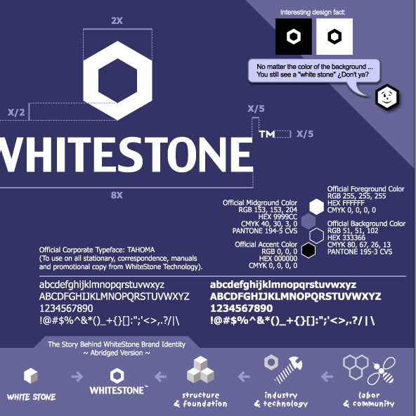
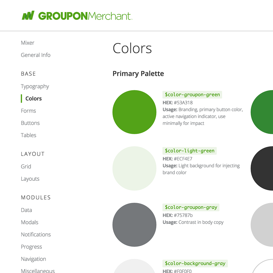
Second line of attack was establishing guidelines for a homogenized branded style, adopting a low-demand global navigation that could easily be adopted by all Nike websites without much reconstruction on an early phase, and educating teams an providers on a common visual language of typography, color palette and design motifs.
Third step was traveling and meeting with all teams, evangelizing the benefits of a unified band and global navigation. Providing support and ownership of common assets.
At Nike I architected the entire digital design department (as I have done in almost any company I join): Scouting, hiring and mentoring all the internal talent; providing roles & and responsibilities to each team member; establishing the processes and dependencies with other company departments; predicting the group's org scalability (the depicted org above reflects only in the beginning, as it grew to almost 40 people); setting the group's accountability & metrics of success; and establishing the external relations with freelance contractors and agencies for hire.
... I call it "Designing Design"
... I call it "Designing Design"
