After a full rebrand in 2018, we got to experience the agile philosophy of “fail fast”… Soon after our first conversation with early clients and potential investors, we knew the truly compelling (and differentiated story) was indeed the people behind the technology (expert-in-the-loop) framed with the ultimate goal of automated consumer experiences (CX).
More than "people helping people", the interest turned to "people training AI".
We knew we had to tweak our messaging (and therefore, our visual narrative):
This time around, we focused on reaffirming our own voice and developing a seamless visual framework across Marketing, Sales & Product within a very tight budget (frugality IS the hallmark of a responsible startup!).
It all starts with a bit of research: It only took a cursory look at both the industries of Help Desk and Artificial Intelligence to see a common, repetitive thread in their branded personalities: Shades of blue, cyborg symbolism, neural network diagrams… and lots of bots. Quick Summary:
Primary Colors: Out of a total of 55 AI companies, 52.73% utilize blue as their primary branding color. The colors yellow, magenta, red, and orange are the least used colors for primary branding choices… an opportunity to own that chromatic space!
Accent Colors: White is utilized by 34.55% of the 55 AI companies and is the dominant accent color. Black came in second place at 12.73%. The least used accent color is red, being used by only one company.
We first decided to ascertain what the industry was saying and promising… adopt the cues that would include us in the conversation (embraced by our new primary black), yet also exhibit a strong point of view that would set us apart (represented by our new primary yellow).
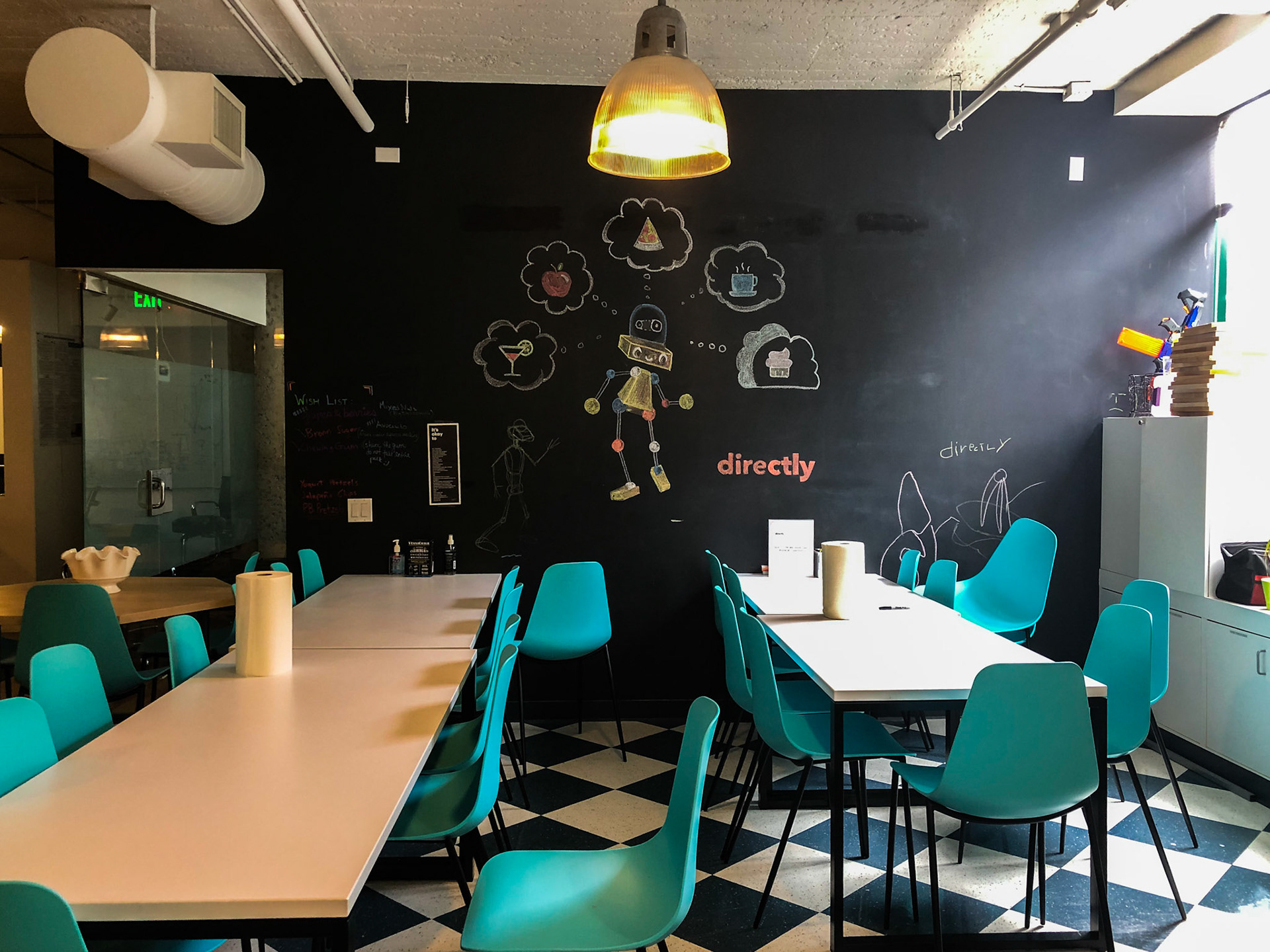
We also knew we had to let go of Domo (which we did ritualistically… in an exercise of team-building graffiti art):
From this point of departure, we went about building the rest of our identity guidelines. I provide below a complete dissection of our documentation as an example for other designers to contrast against their own branding challenges.
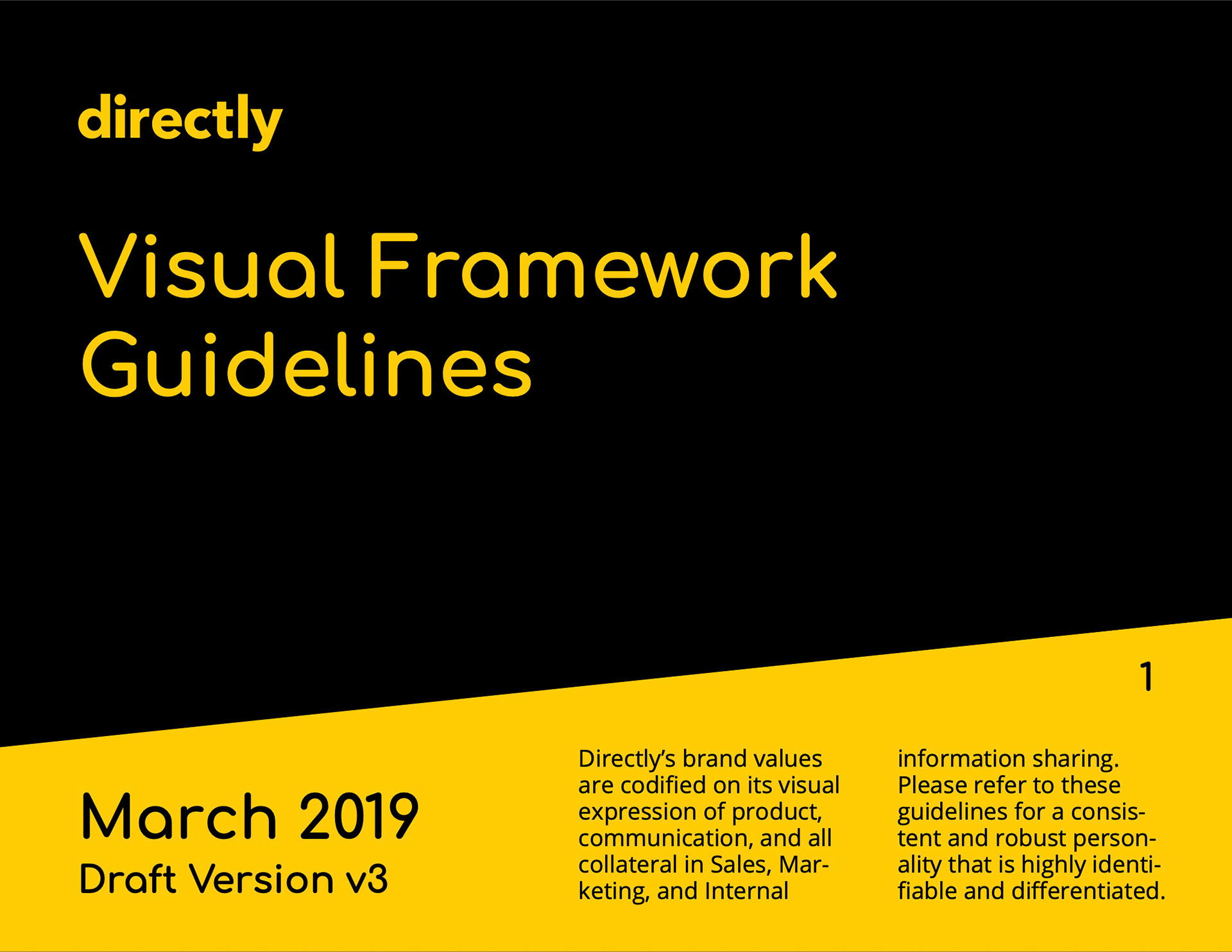
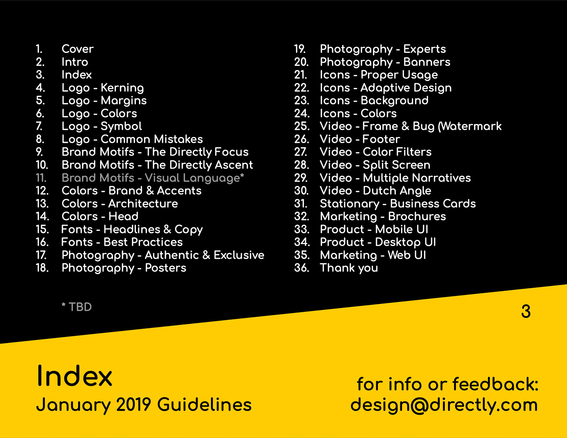
You obviously start with a presentation: It should include an intro, a mission statement, and an index of content:
Directly’s Mission: To improve the customer experience by improving how people and companies work.
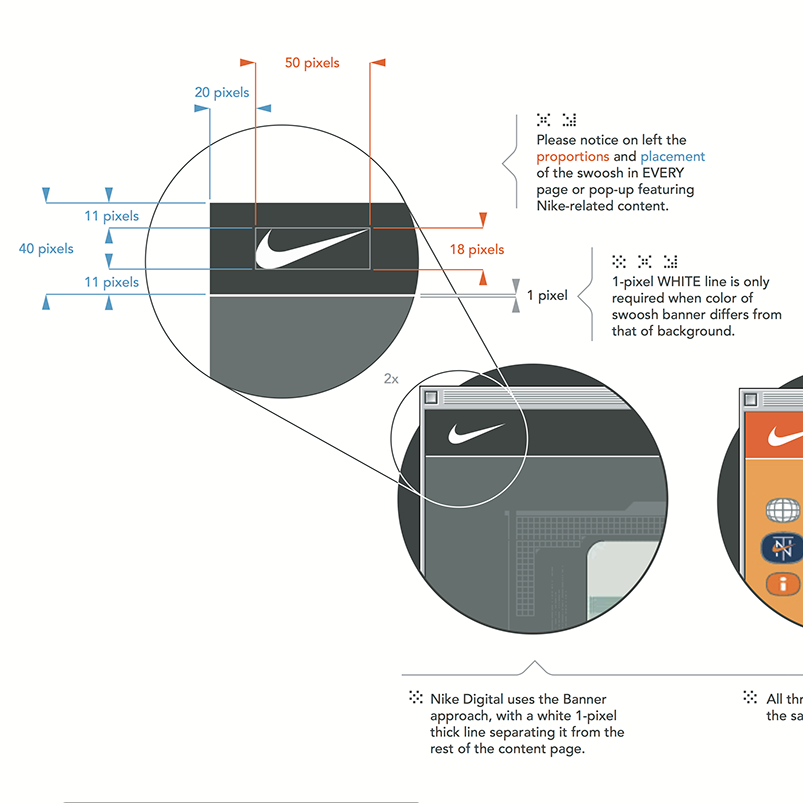
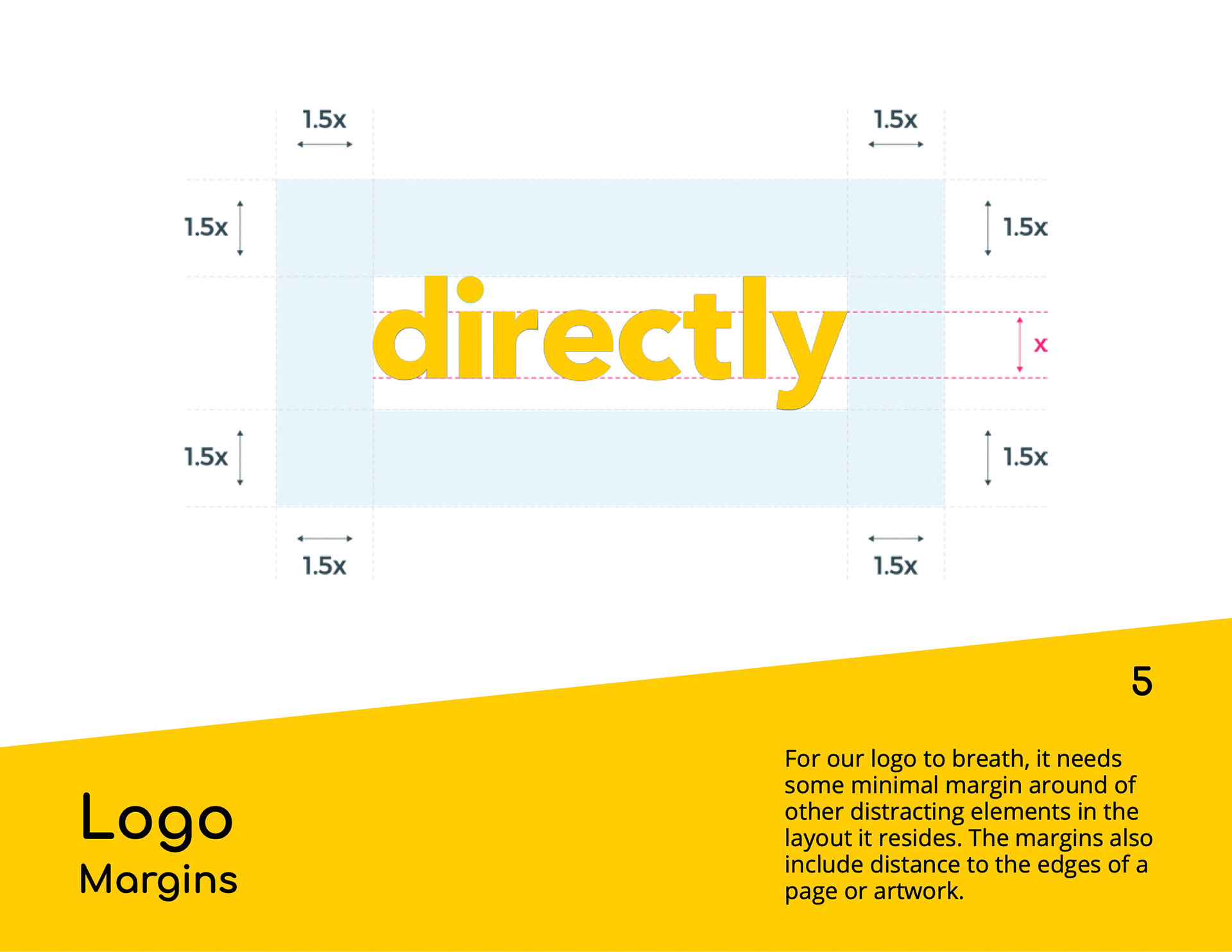
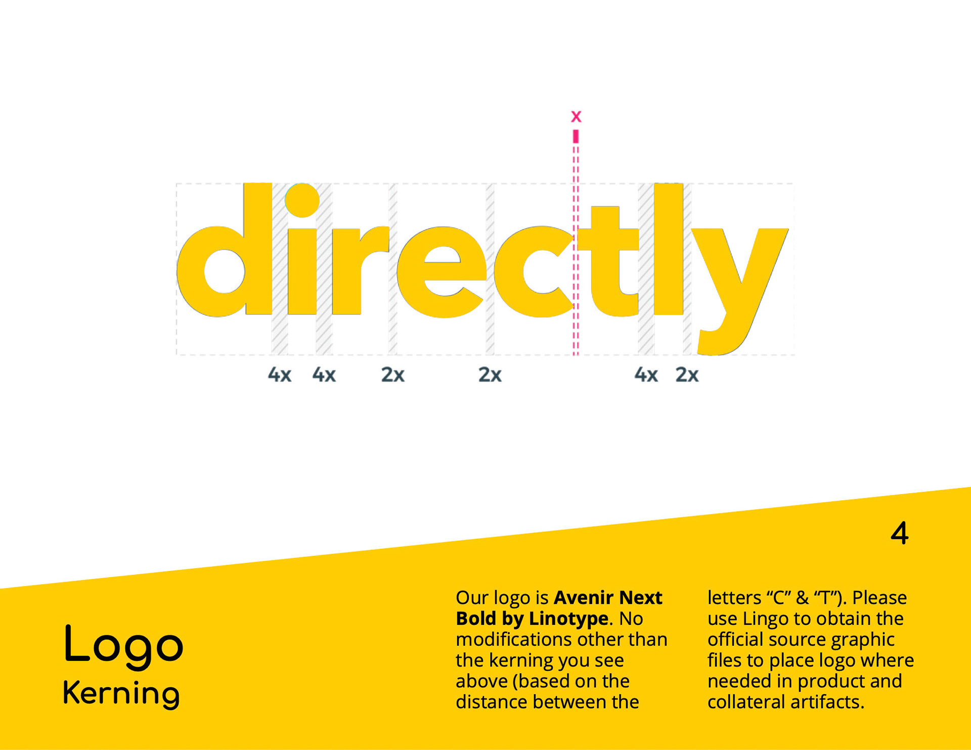
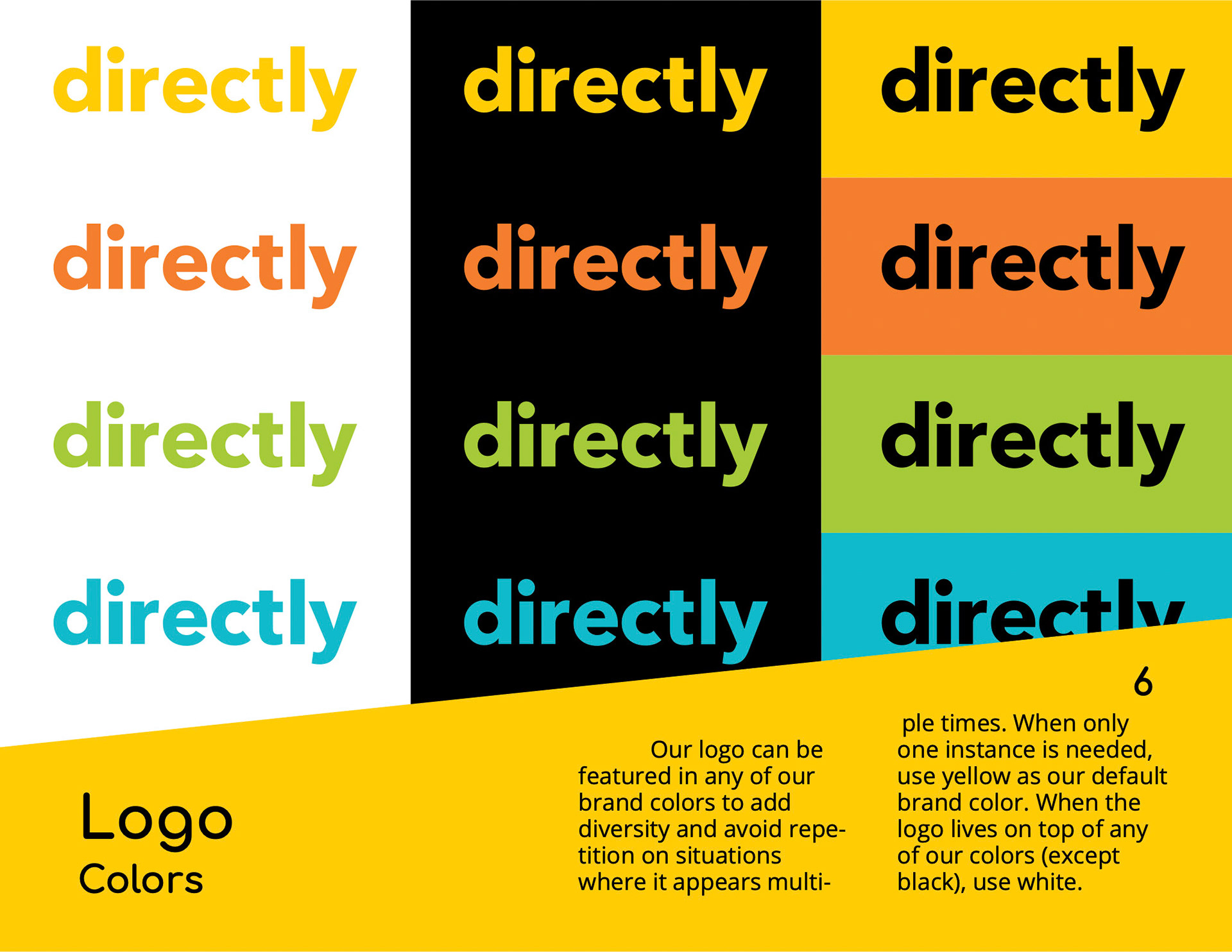
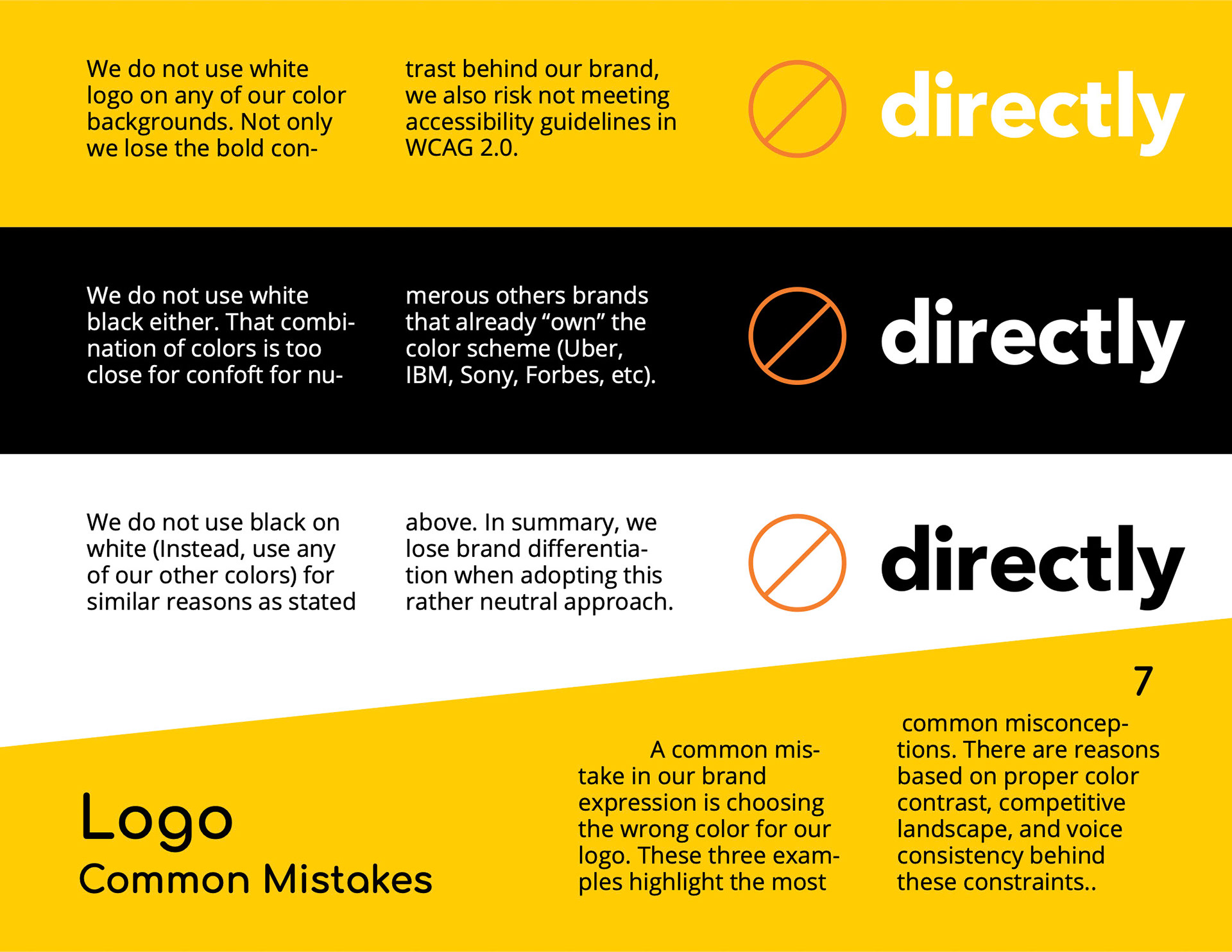
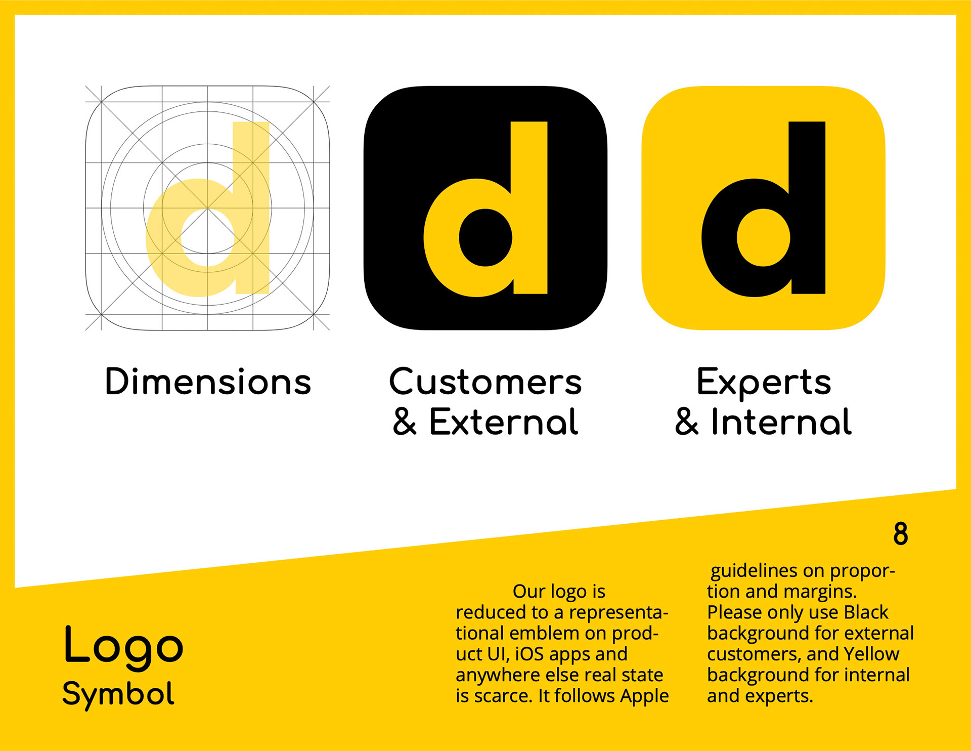
We provide guidelines for the legacy logo … a yet-to-tackle issue! (a new post will be dedicated to this topic when we update it): Logo dimensioning, how to place it in context, what color combinations… and the usual no-nos.
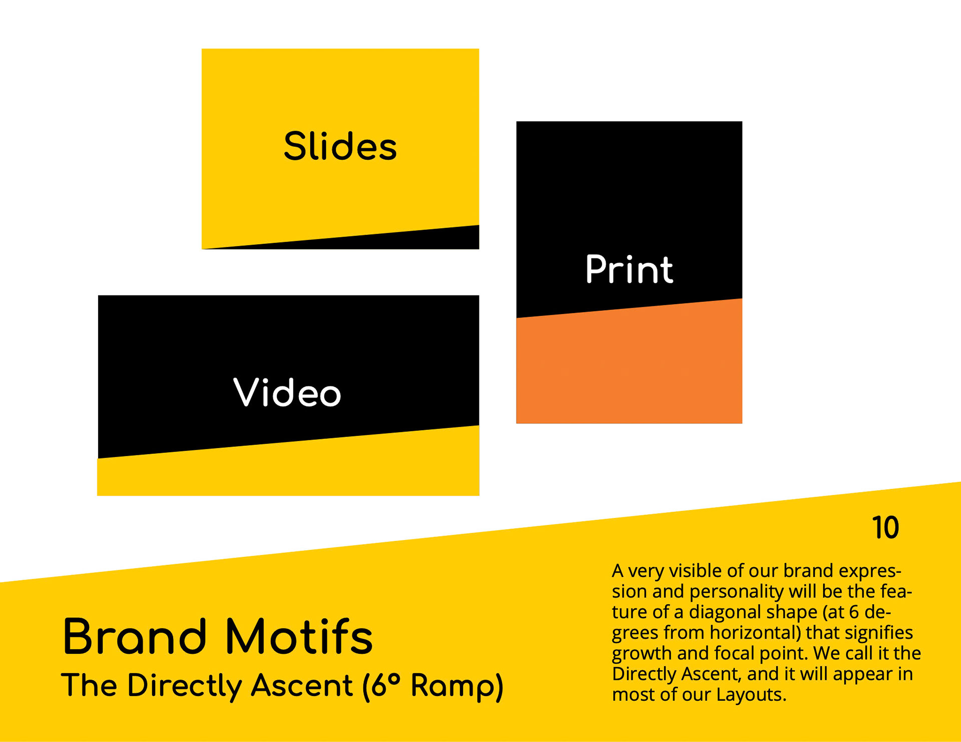
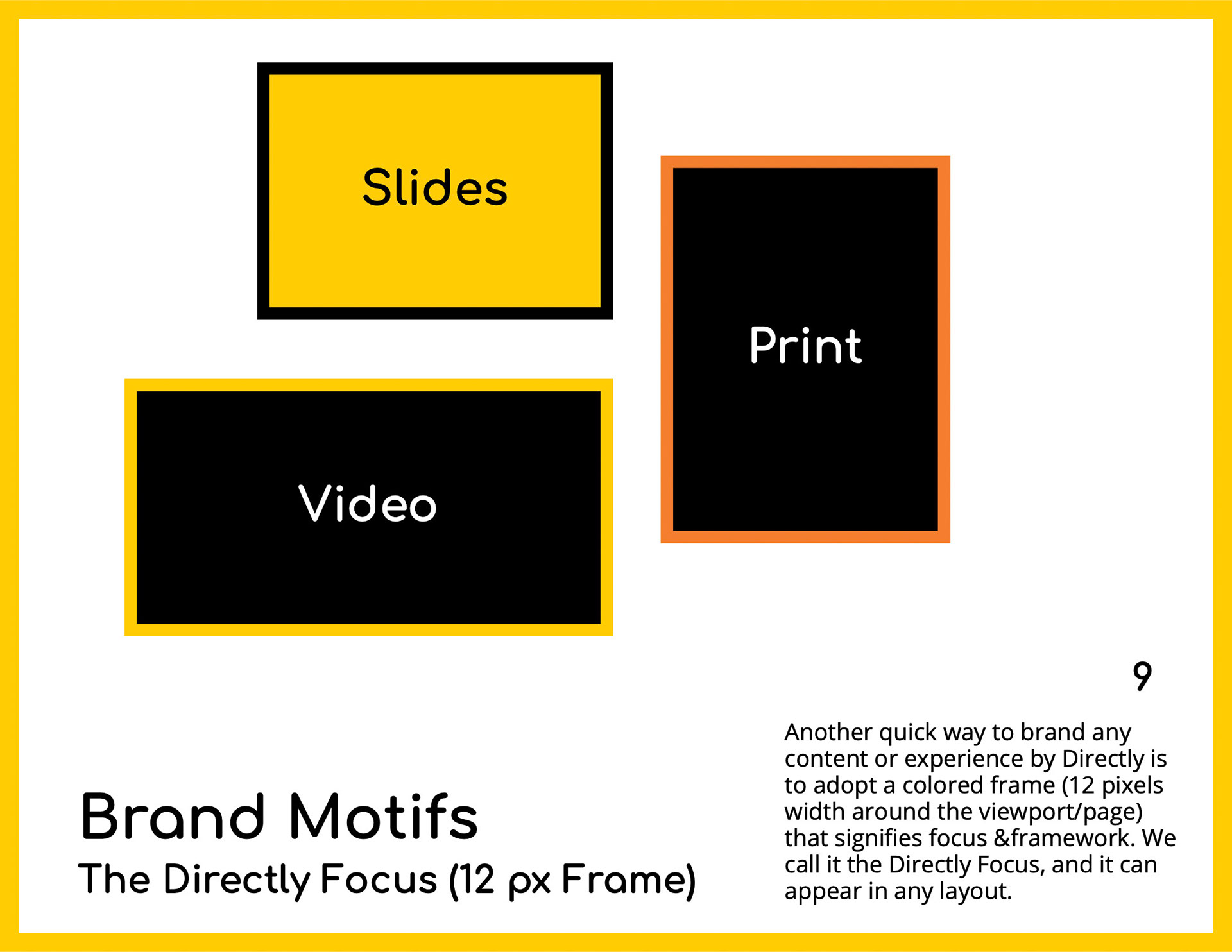
The branded motifs came next… this is the beginning of our baseline for crafting our visual DNA! (see Video Guidelines later in this article to witness their usage continuity).
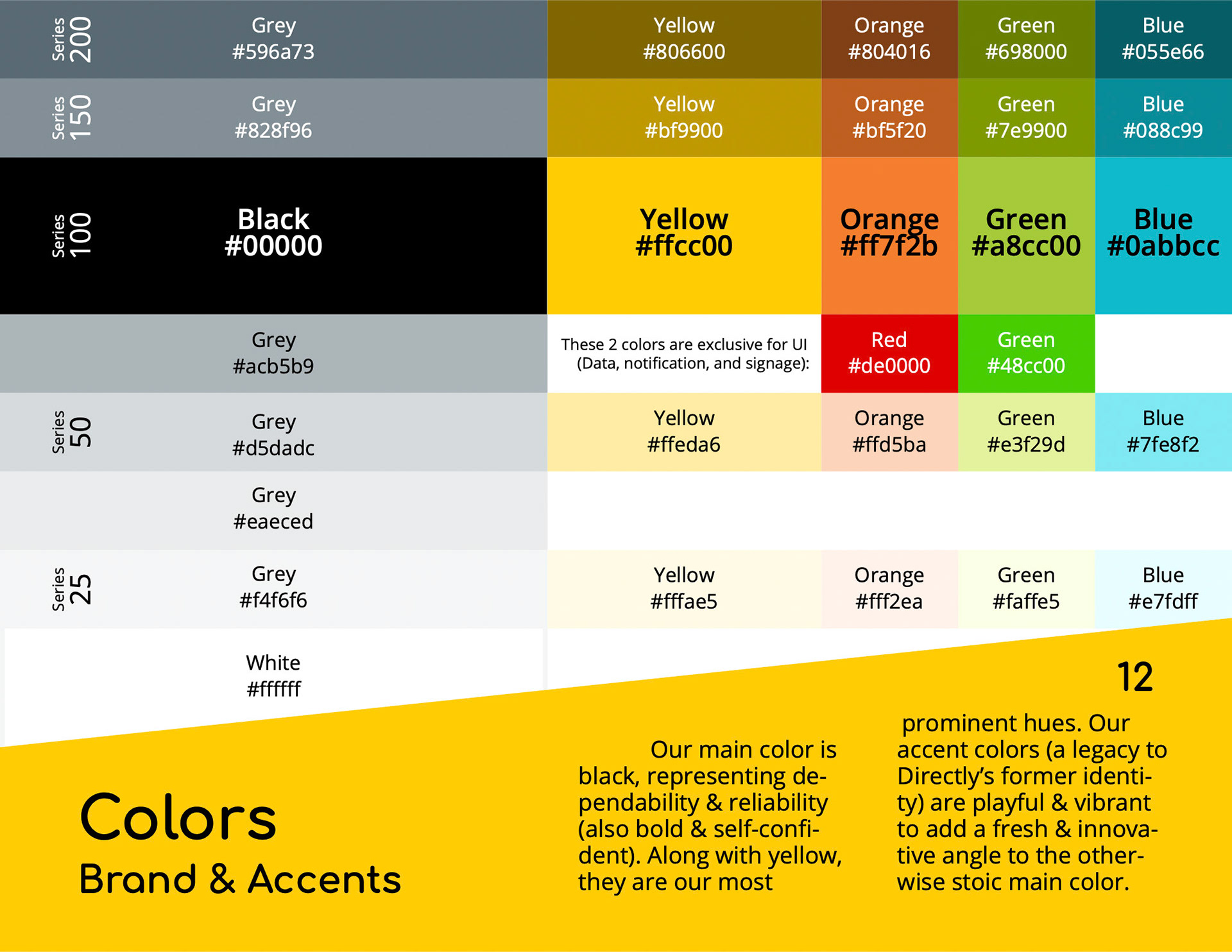
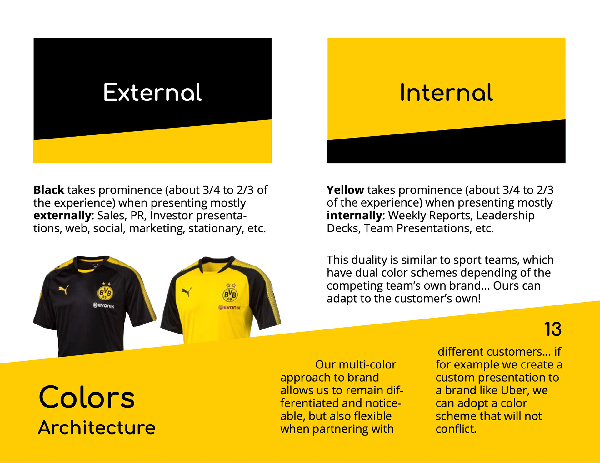
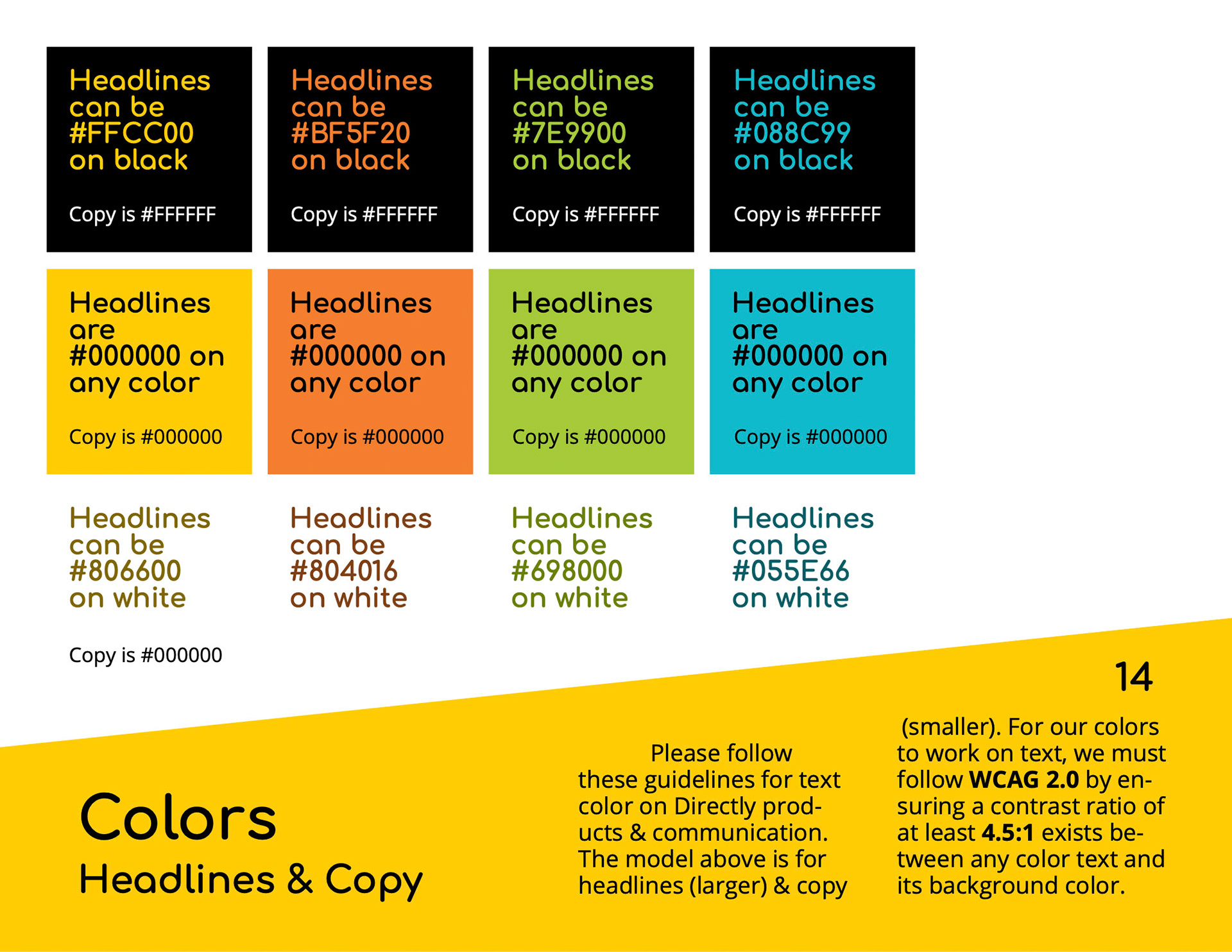
Of course, we tweaked the all-important colors I spoke about earlier… A tip of the hat to our legacy: We continued using the same palette (ensuring a constancy and justification of our brand origins) but we gave prominence to black and yellow (the results of our research). We also made extensive accessibility tests to prescribe the best pairing between fonts and backgrounds for proper and legible contrast ratios (thanks to the tireless work of Michelle Sheu researching this topic!)
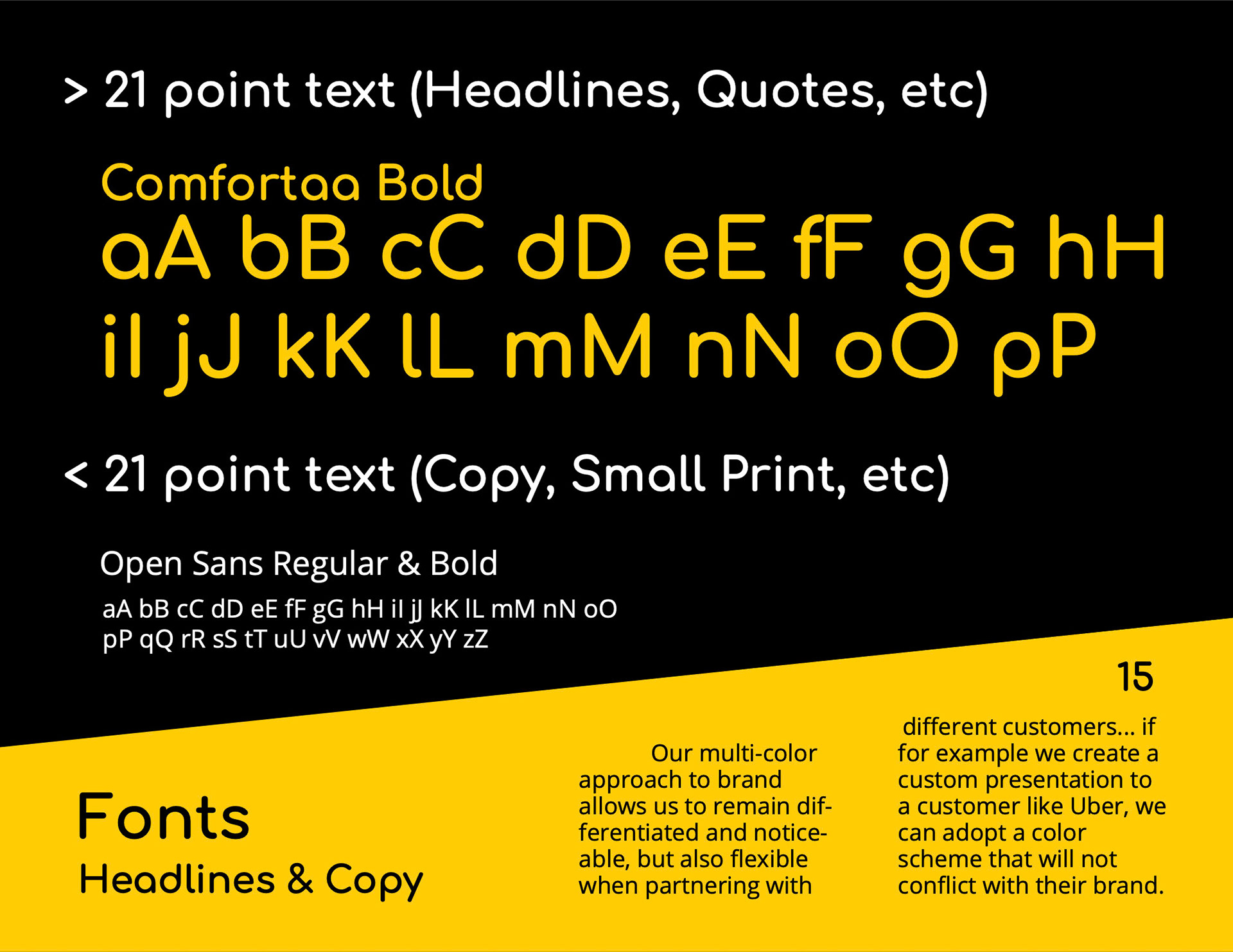
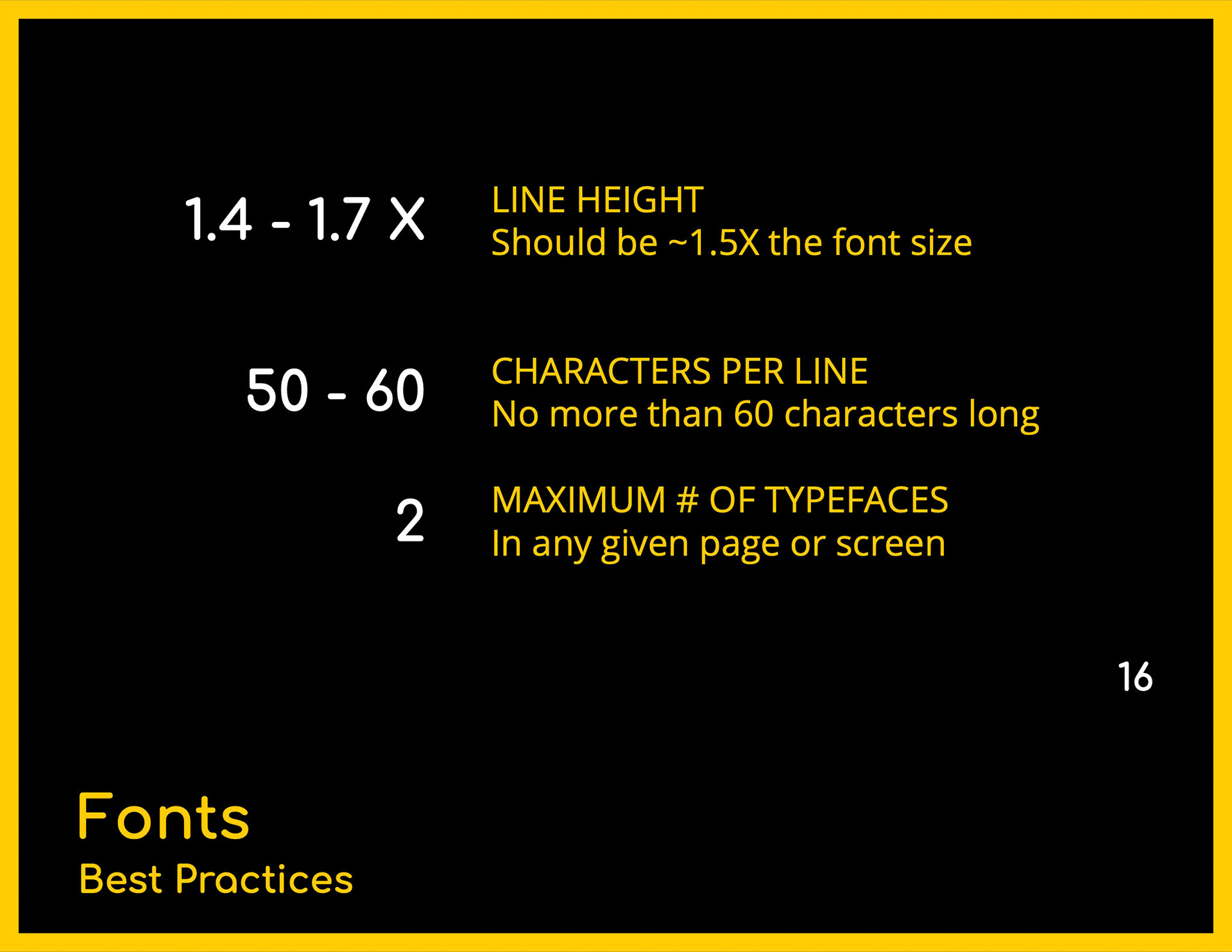
Fonts were chosen to provide us with a bold yet friendly personality… and also easy (and inexpensive) to deploy: Google Fonts will always be the best go-to solution!
Photography guidelines were fun to concoct, using the help of a local photographer (Paige Green from North Bay) to provide us with the authenticity that stock photography could never do:
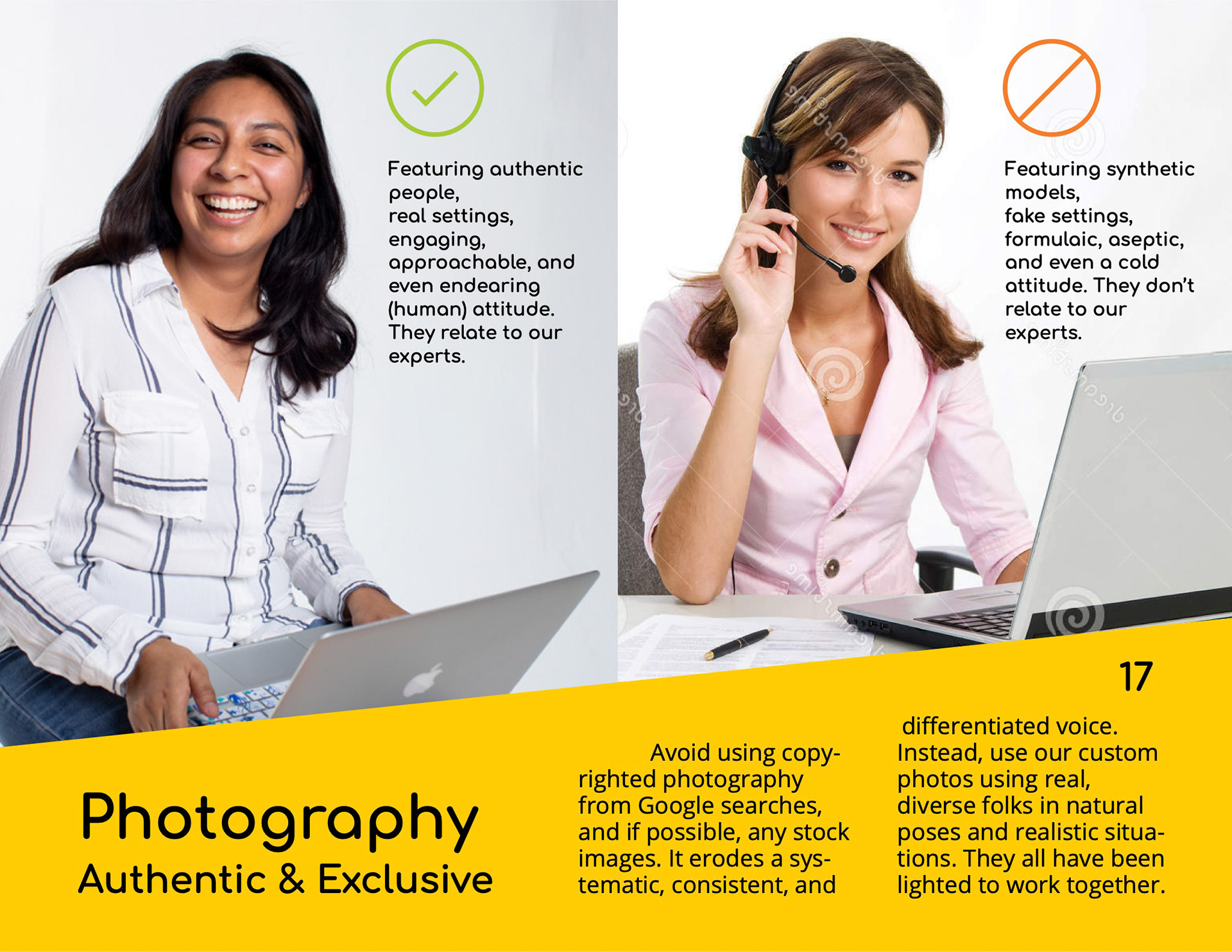
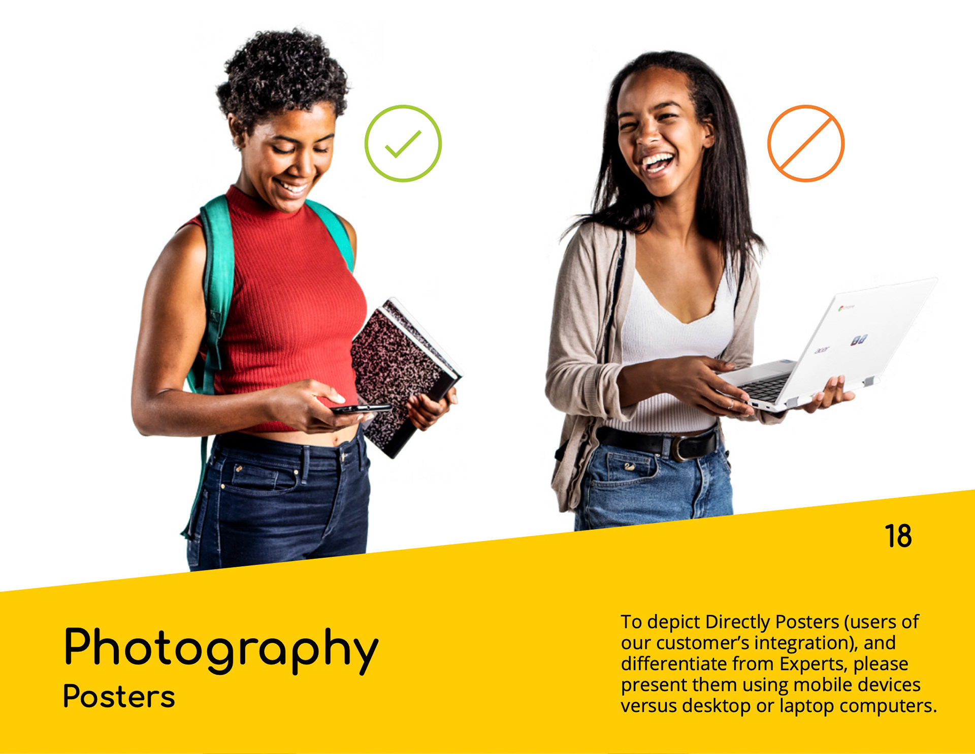

… this photography was further stylized by applying greyscale filters and colorizations of focal points of interest, helping both unify them and provide them with an implicit narrative:
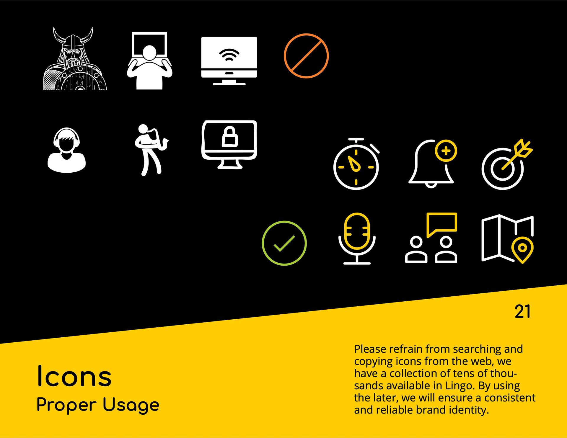
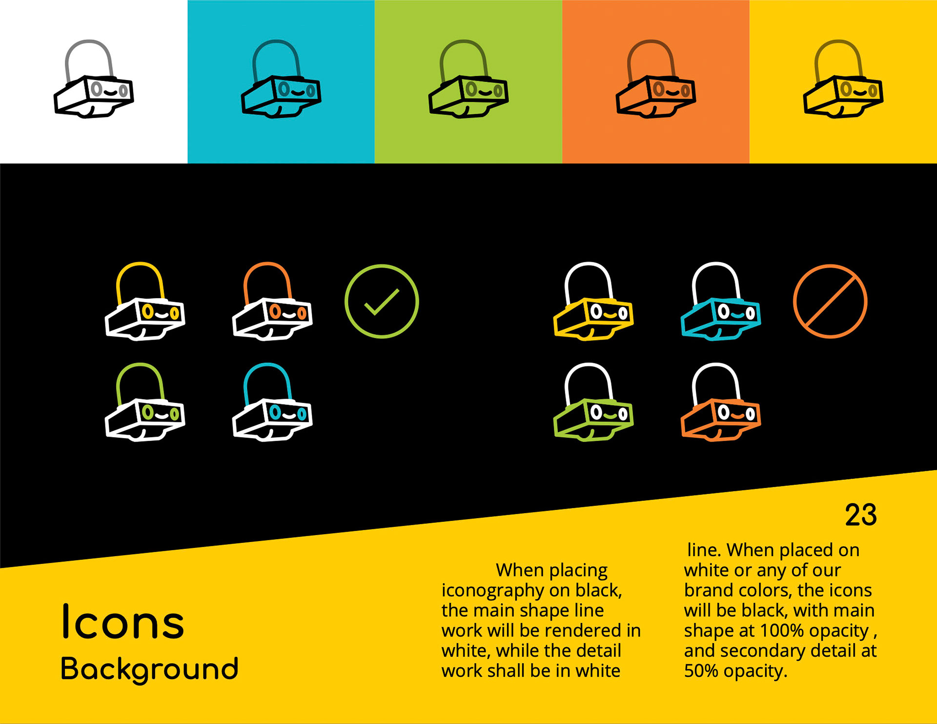
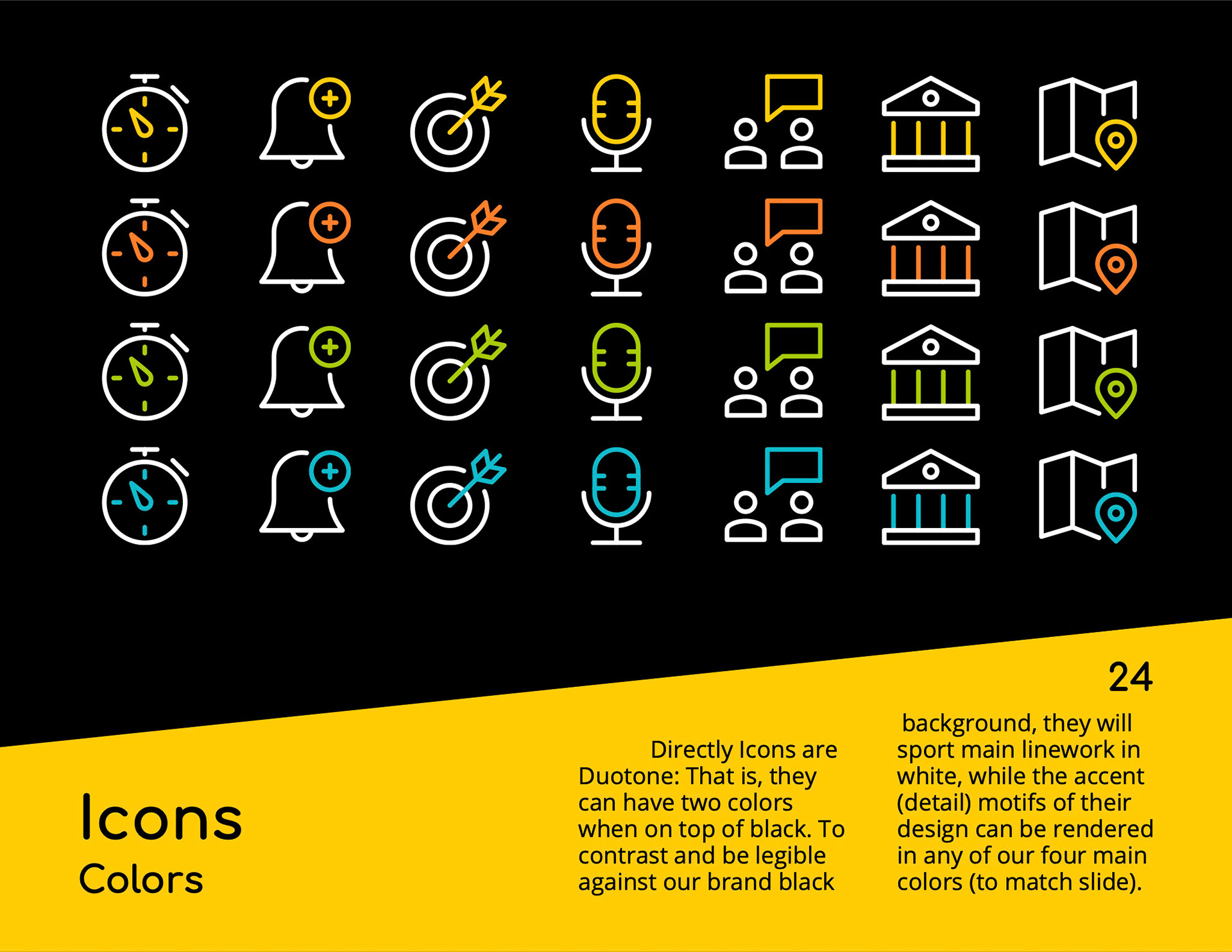
Iconography came next… starting with the purchase of an existing large collection (by Nucleo), and then slightly modifying colors and line thickness to add a bit of personality. We generated different detail versions so to have truly “responsive graphics”, delivering the right amount of signal to the right level of real-state prominence (i.e. The larger the icon, the more detail it can afford):
For the sake of temporary expediency, in our illustrations, we simply adopted an extensive collection available for purchase (Streamline Illustrations) and modified some detail and color to make it a bit ours (this resource got us a quick solution, but will be reconsidered in the months ahead).
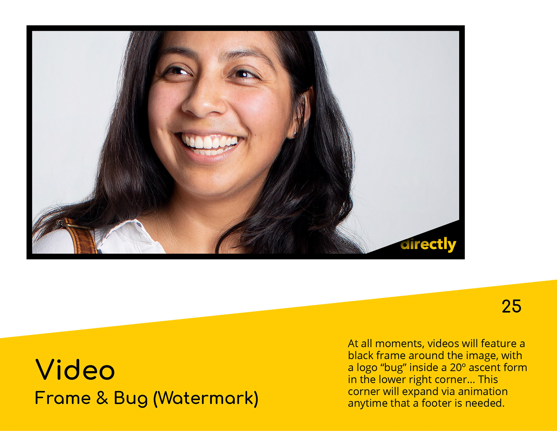
Video is an important part of our storytelling, we use it to give voice to our experts and our customers… and it is also an opportunity to showcase our unique and distinctive dancing moves (in the form of subtle transitions and micro-interactions).

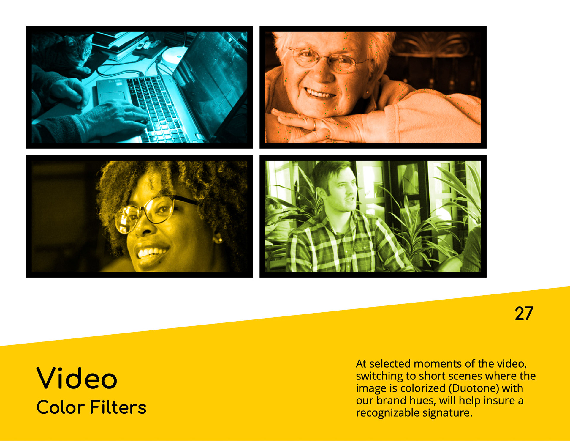
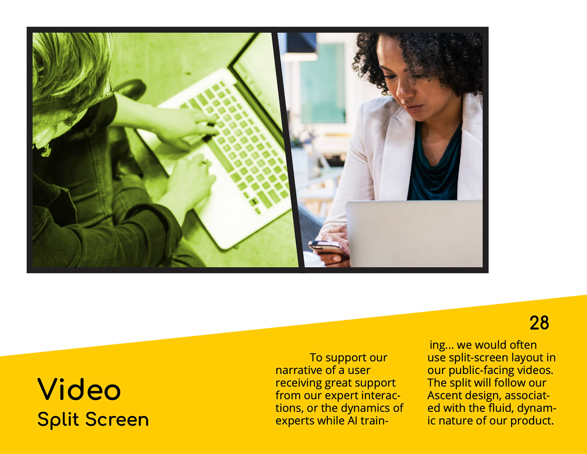
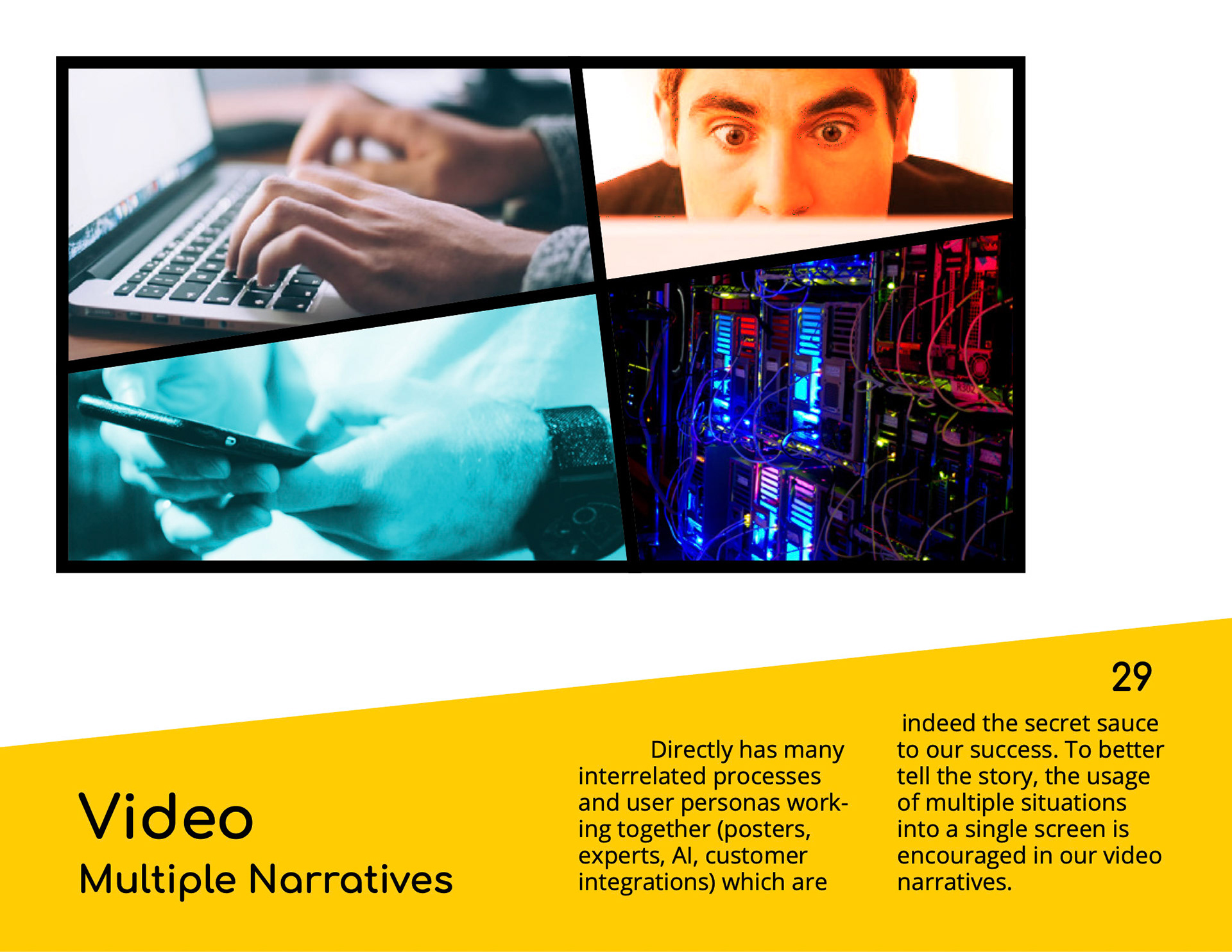
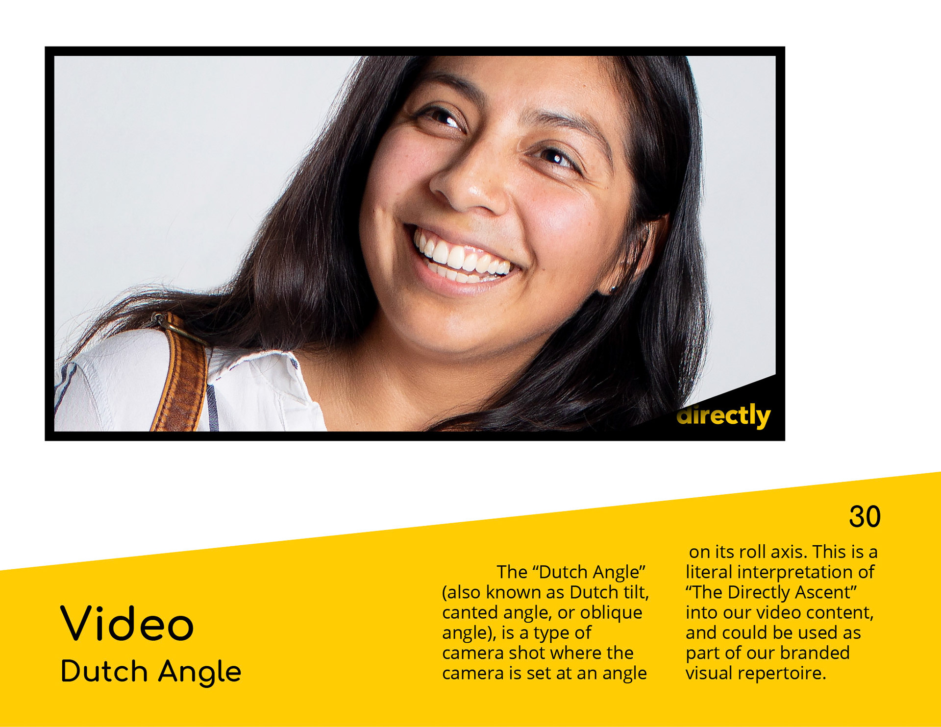
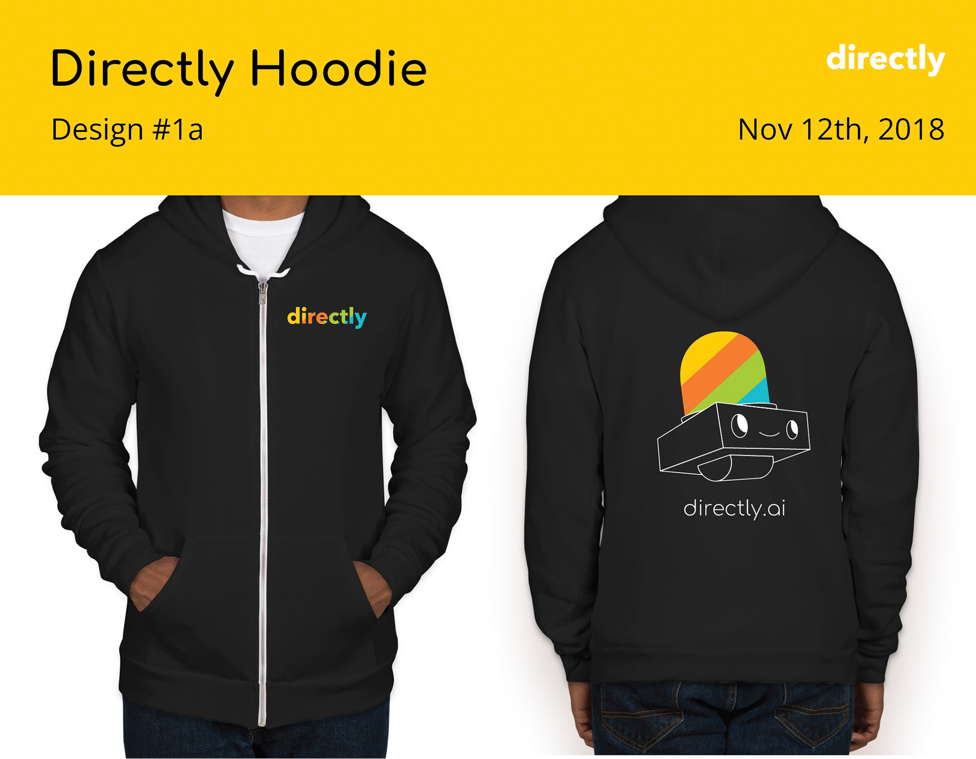
With all previous guidelines, our marketing artifacts started getting a consistent look and feel:
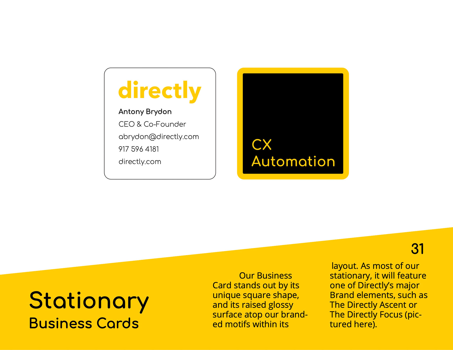
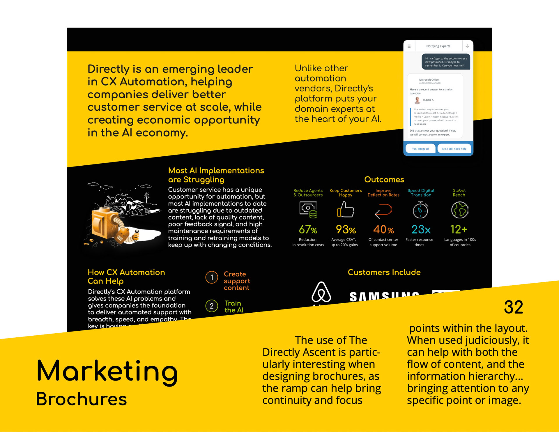
… And of course, so did our user interfaces in Product and web interactions. A full self-referential arc starts emerging!
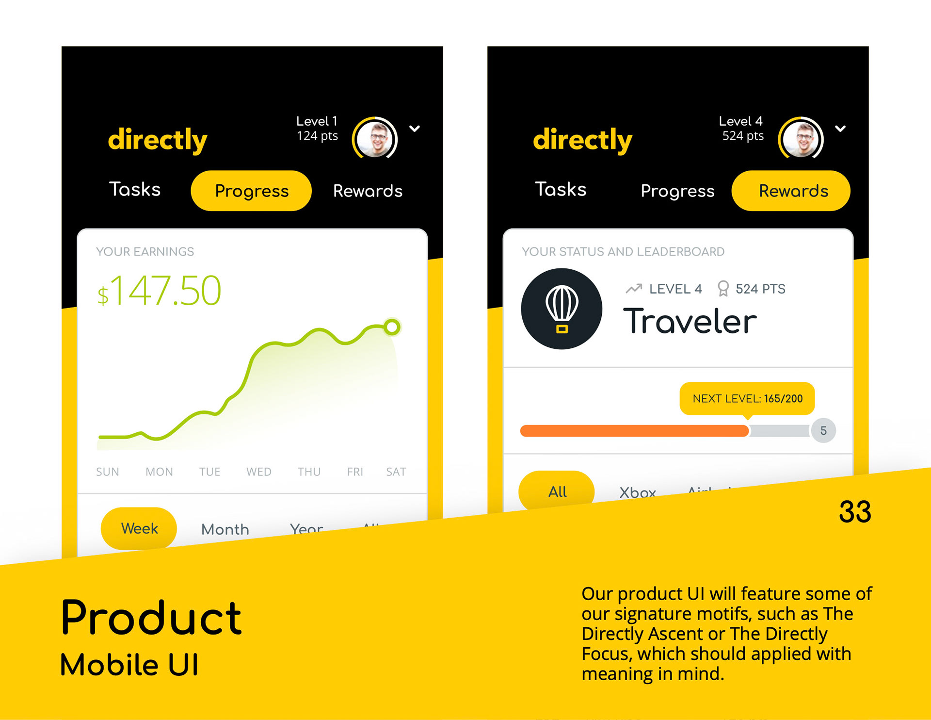
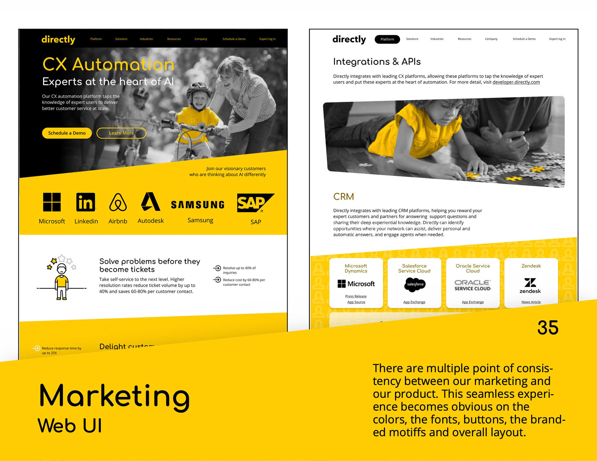
We also made an attempt to change the logo from the legacy mark (made simply with a commercial font typed into a Microsoft Word document), but alas, leadership was not ready to prioritize the hassle that comes along with updating it everywhere... You can't win every battle!
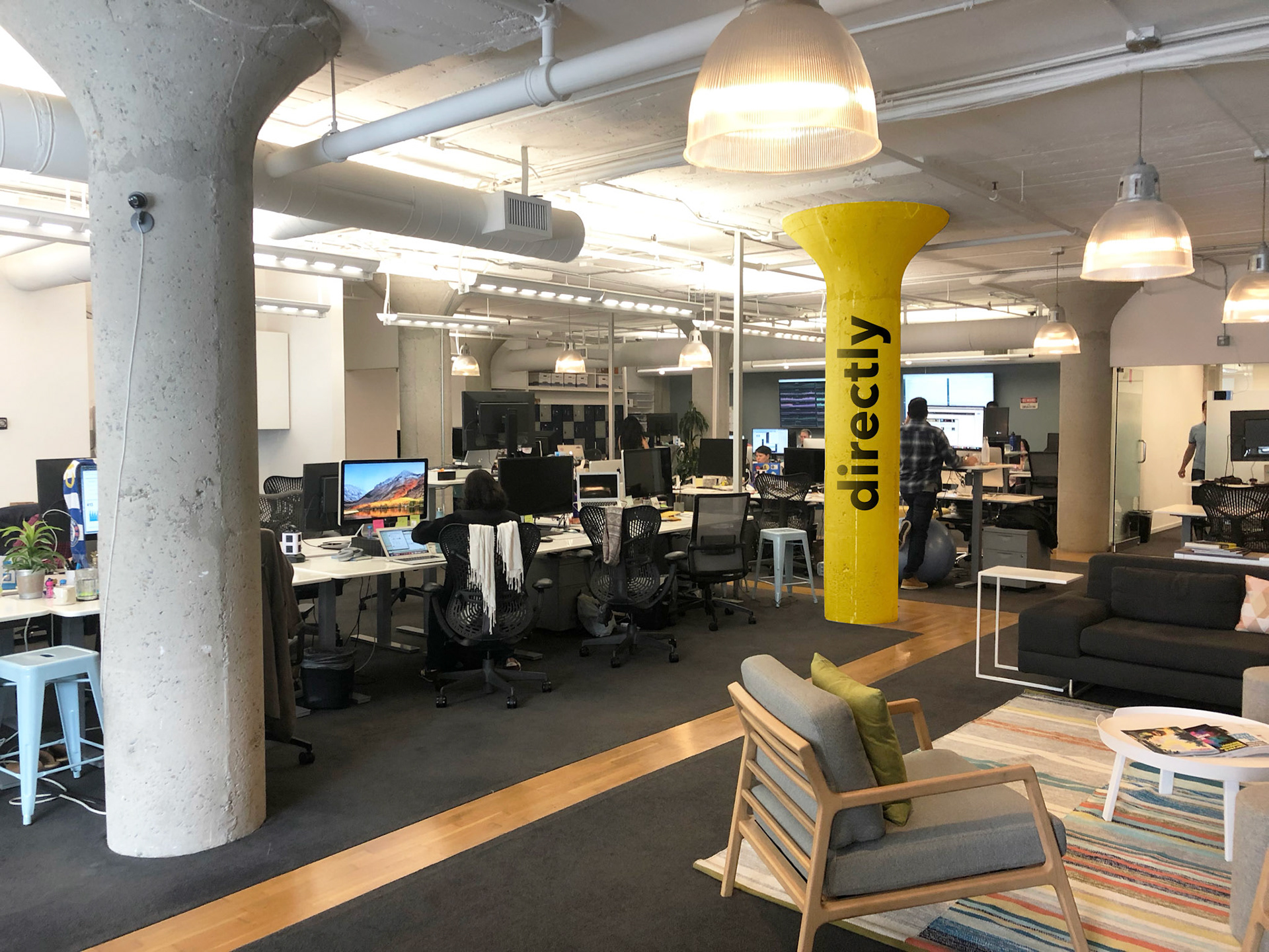
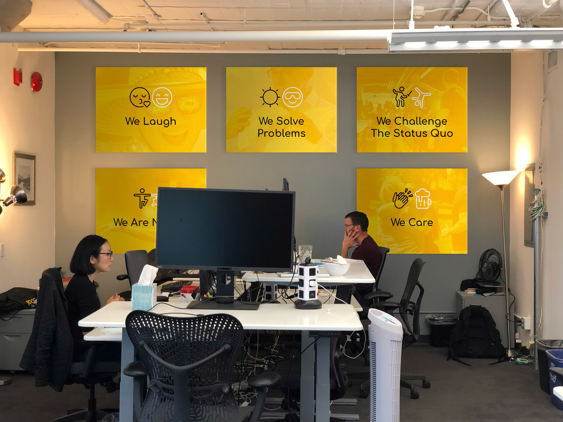
The resulting guidelines became soon a full-fledged visual framework, with resources such as logos, icons, etc. all available to anyone in the company in a simple, easy-to-use. self-serve Content Management System powered by the delightful Lingo app. This ultimate single destination became the source of truth for all our brand assets which will provide the necessary ingredients for creating all our product and communication artifacts… but most importantly, the internal culture and values
Check how we put it to practice in the third part of this series: The Re-Making of our Website


