Directly's brand... BEFORE:
In the case of Directly, (a customer-experience solutions company at the crux of artificial intelligence and expert/trainer crowdsourcing) we started exploring archetypes and visualizations once this intriguing (genius, we think) equation of mixed strategies took its final shape. How could we now portray this novel approach via quick-to-grasp imagery?
By early 2018, Directly had embraced a pretty safe look for their website and other communication materials: The blue fonts and iconography on white background, the standard photography, and all the graphic elements were aimed for the company to blend in –be accepted–, rather than stand-out. This strategy is not atypical of new companies when trying to carve respectability and gain credibility in their respective industries during the early years. Everything changed in that year, after a boost of Series B investment, it became obvious it was time to afford self-confidence, and allow ourselves to be bolder, memorable, and differentiated: We had something to say and we were not afraid to do so loudly!
We started with our colors… a quick survey of major brands indicated we blended in perhaps too well.
To keep the change justified internally (to work well with existing products and materials, and be respectful of our legacy identity) we opted to simply switch the primary colors (more aligned with the past leaders of the fixed economy) with the secondary ones (more aligned with the champions of the fluid economy).
We also did not choose a single primary one, we chose four instead! … and allow our brand to morph and adapt to its context (helpful towards avoiding conflict with any of our customers’ own branded color) Why commit to one when our industry, our clients, and applications, were so diverse?
The result: A much fresher, brighter, open, optimistic outlook.
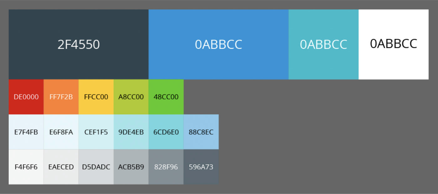
OLD palette arrangement
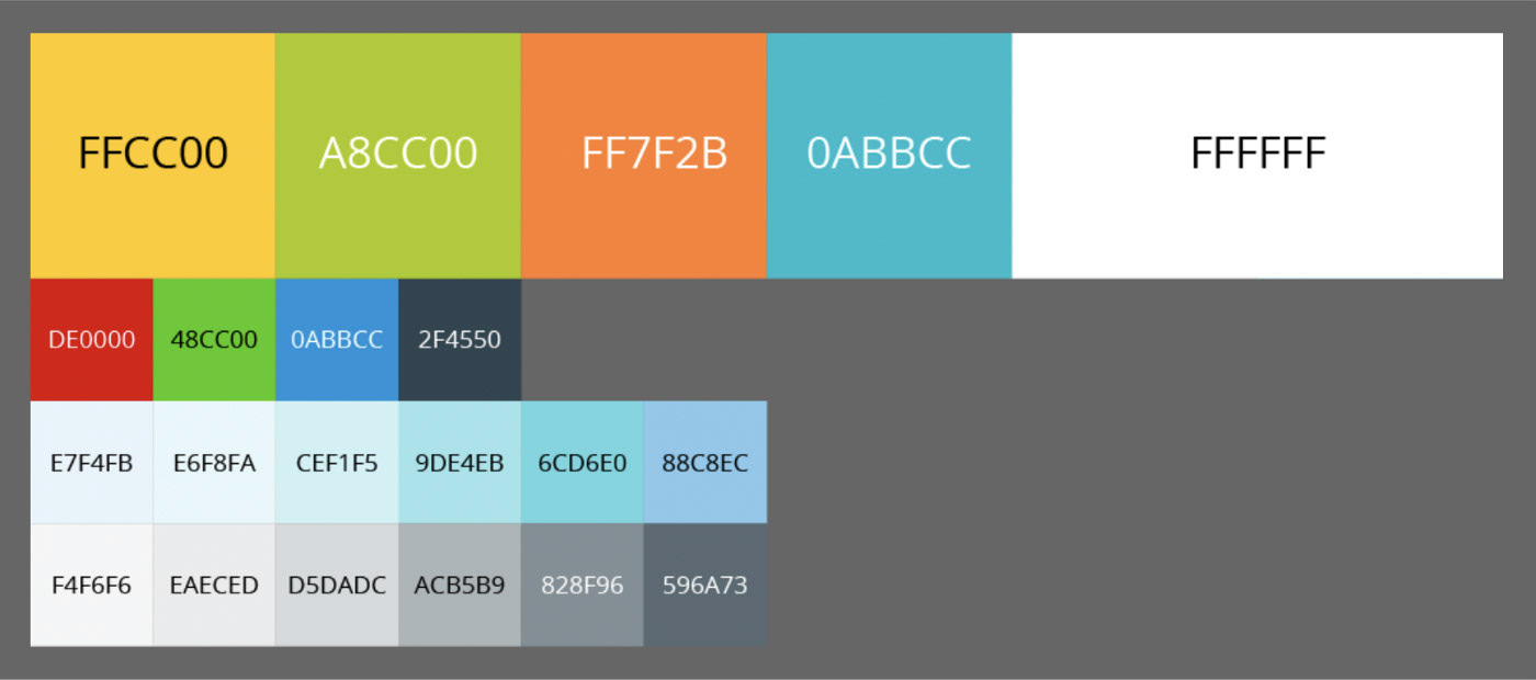
NEW palette arrangement (primary and secondary colors were switched)
Once our hues were redefined, we moved to the next phase of our re-branding exercise: our signature imagery. We wanted to focus on the main differentiator of our product: It is based on Artificial Intelligence indeed, but unlike countless alternatives, ours is curated and trained by humans. People who are experts and passionate about the subject matter (usually, by being enthusiastic users of the same product they support).
We realized that from the narrative point of view, we needed to highlight both main players in our storytelling: A complex software solution (AI) coupled with easy-going interactions between humans.
To represent the latter, we used photography (more on that in the third post of this series) … for the abstract layer of AI though, we decided to rely on more flexible illustrations (a better tool to enact what cannot be seen).
Domo was born.
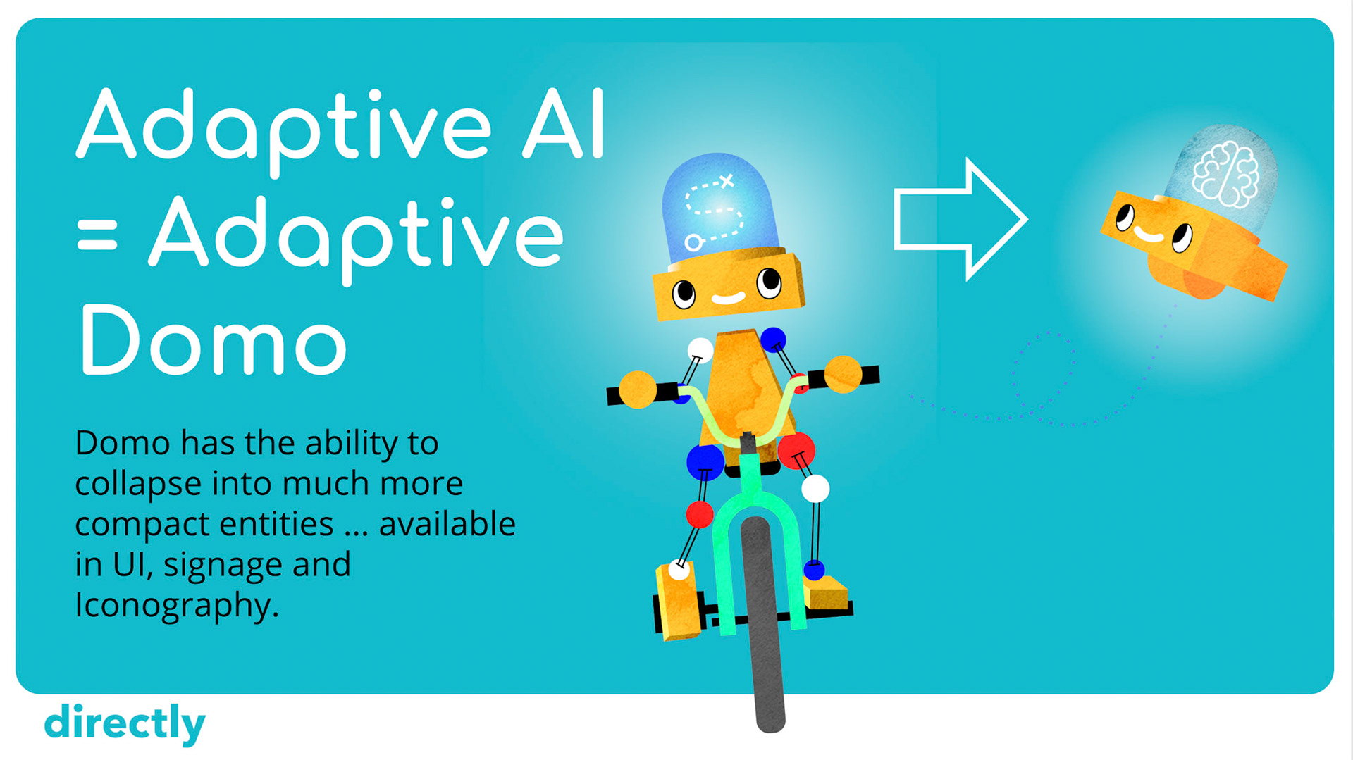
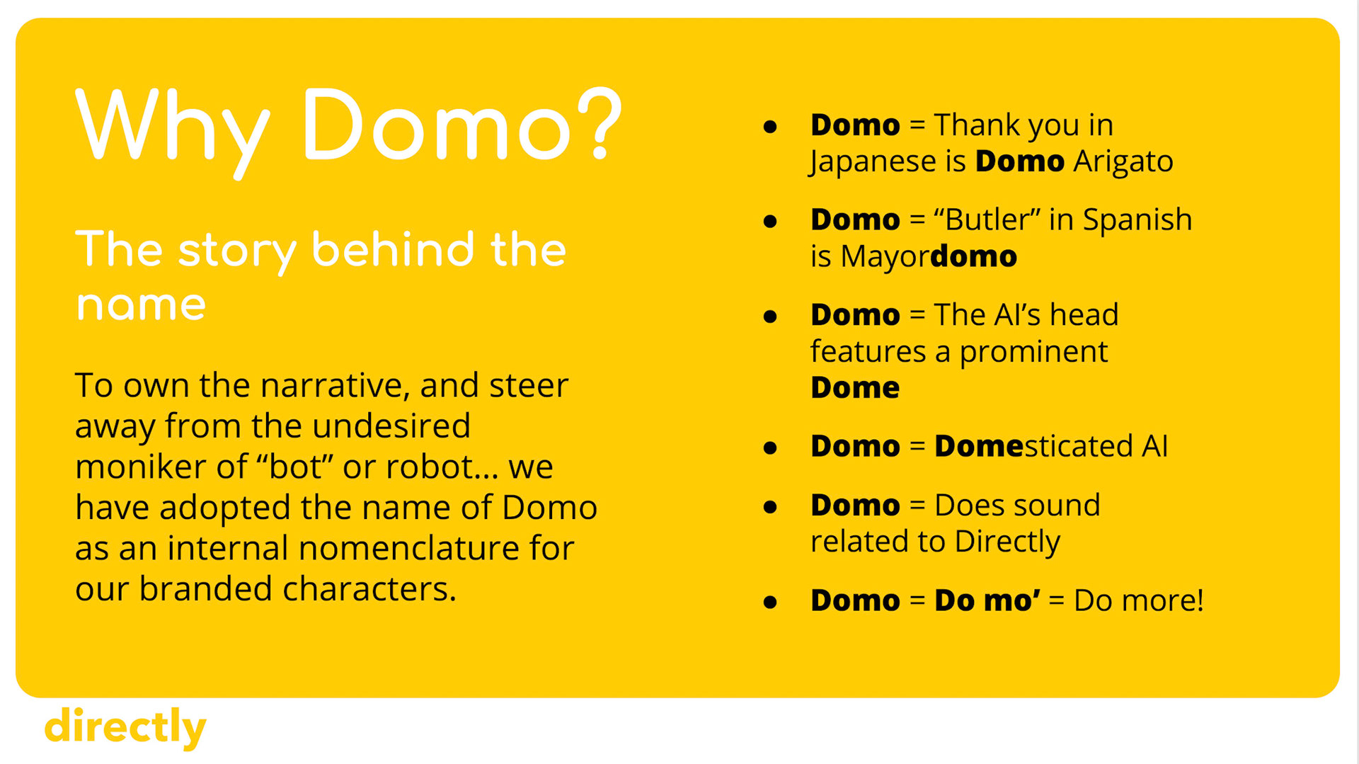
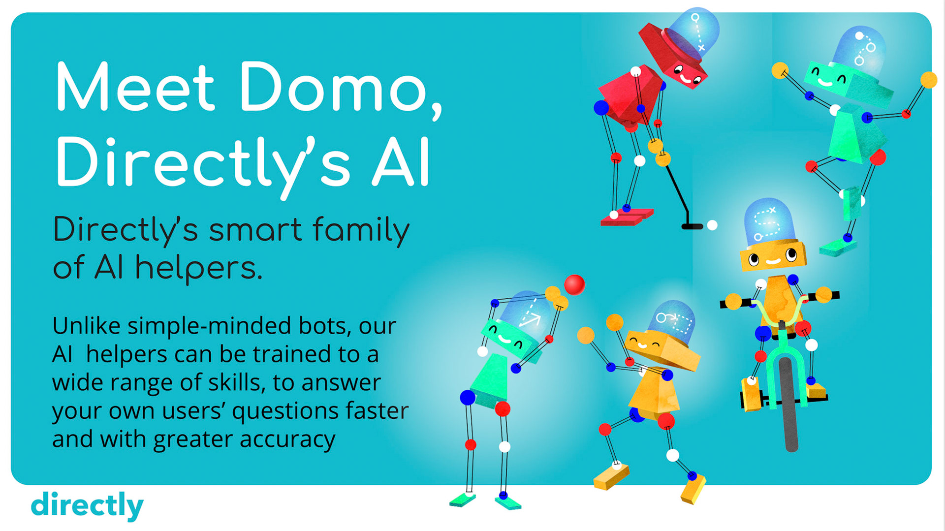
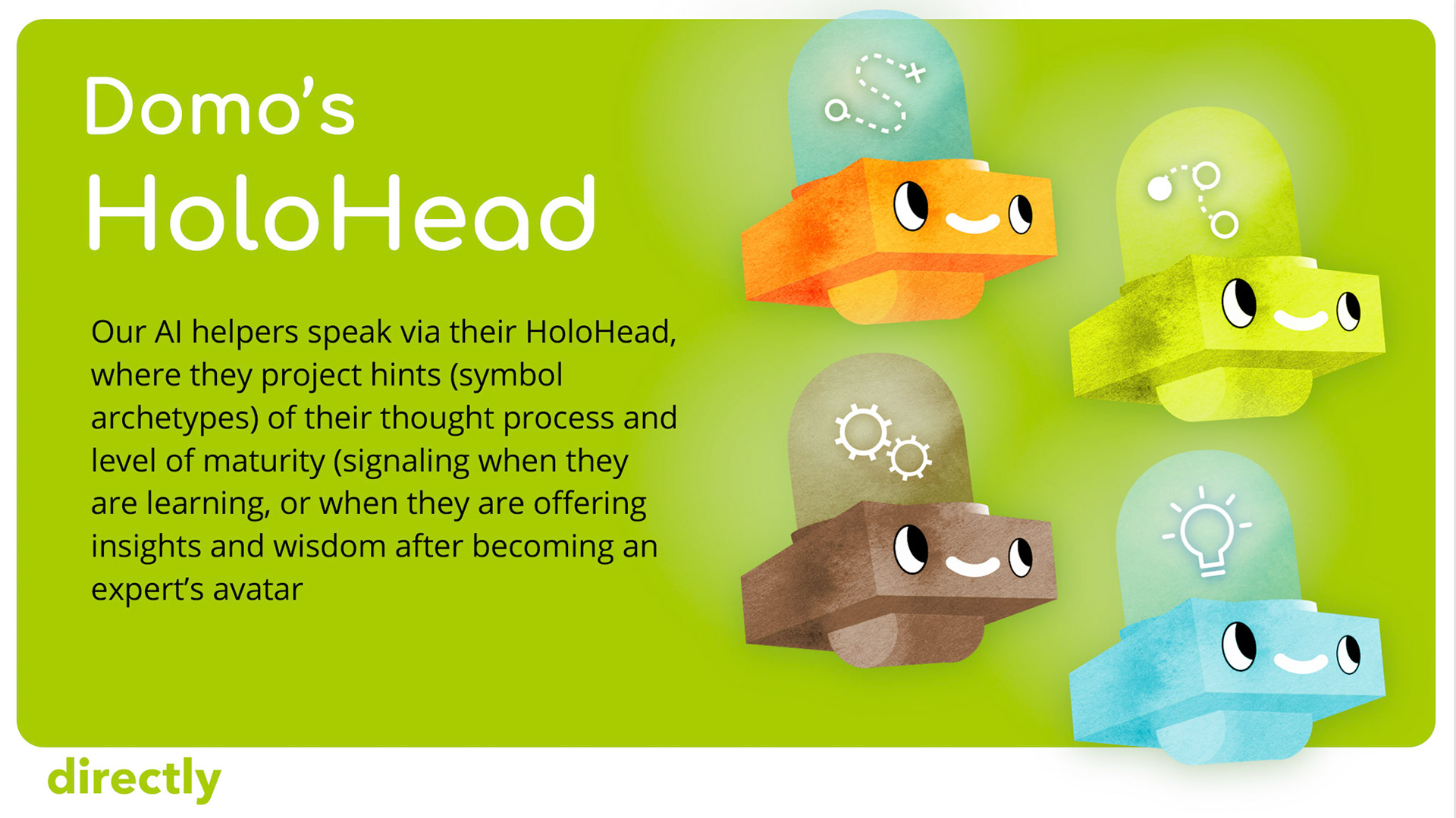
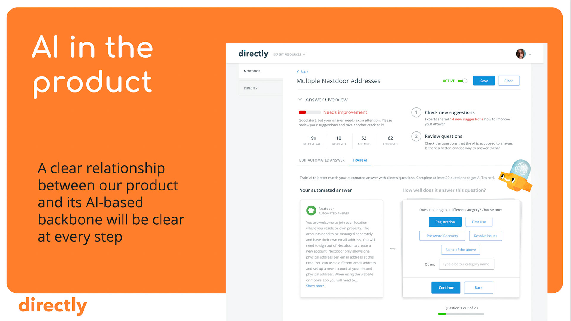
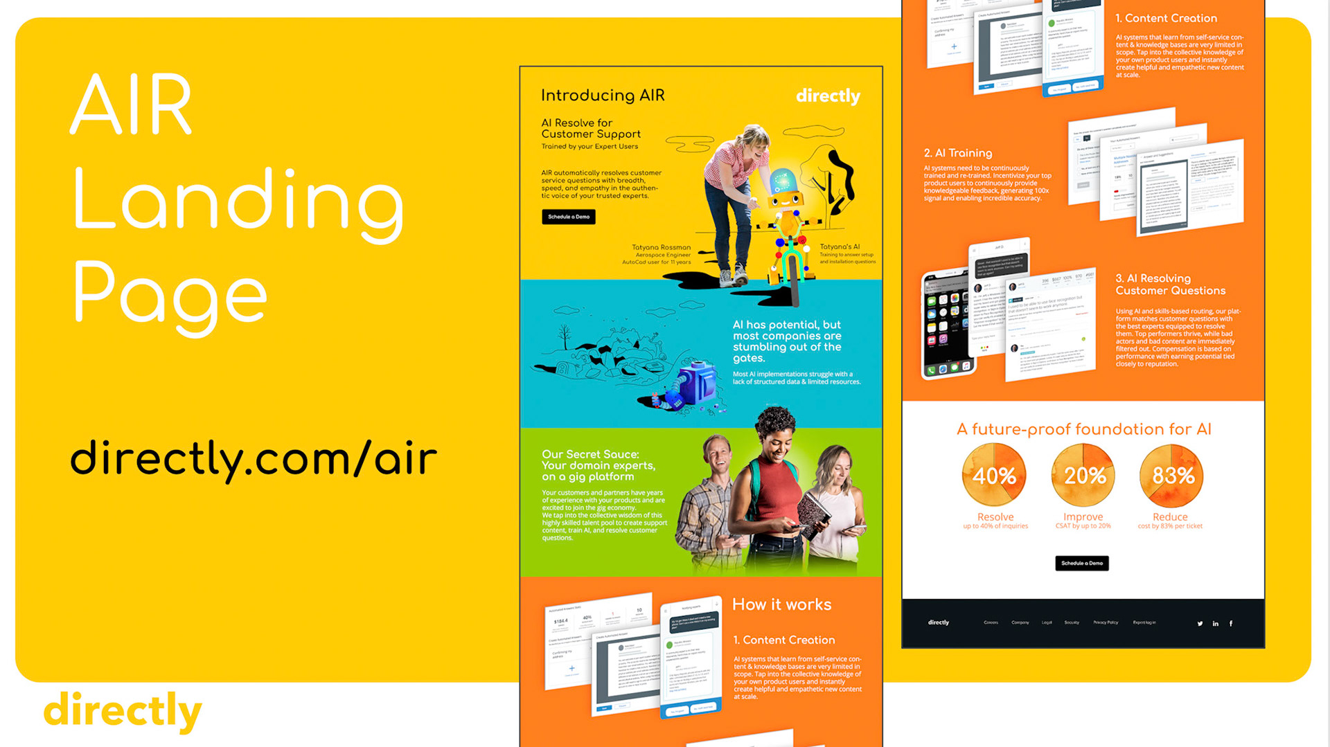
Despite the cliche of robots associated with our industry, we embraced what had become the visual archetype for such solutions.
The results (authored with the help of the talented team behind Croke Estudio) were fun and intentionally memorable. The illustrations worked with the photographs to convey humans training a friendly AI, as a way of empowering the latter towards the further training (supporting) of other people… People-Powered AI almost rolled off the tongue when describing it!
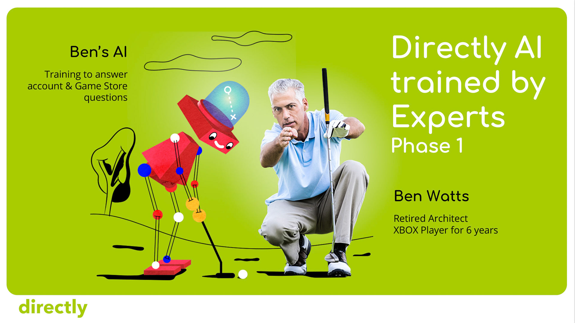
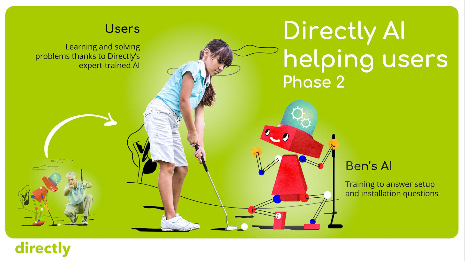
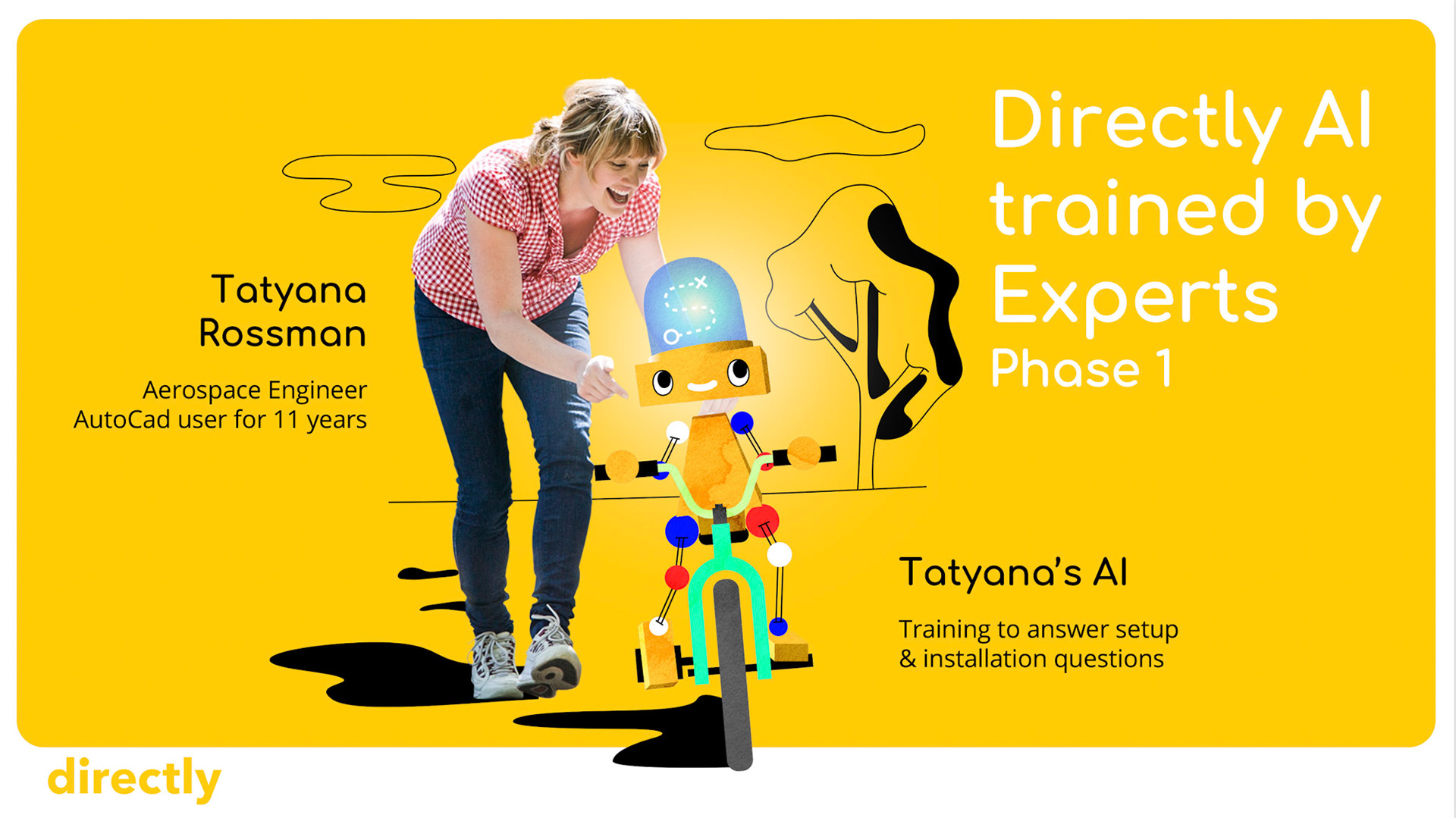
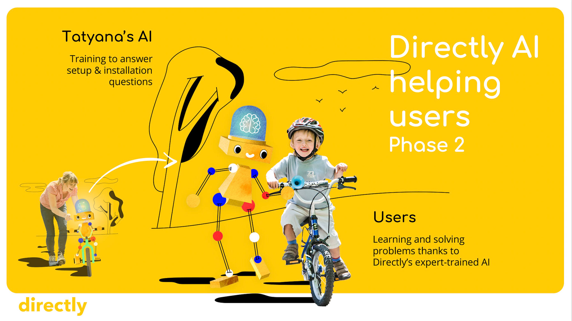
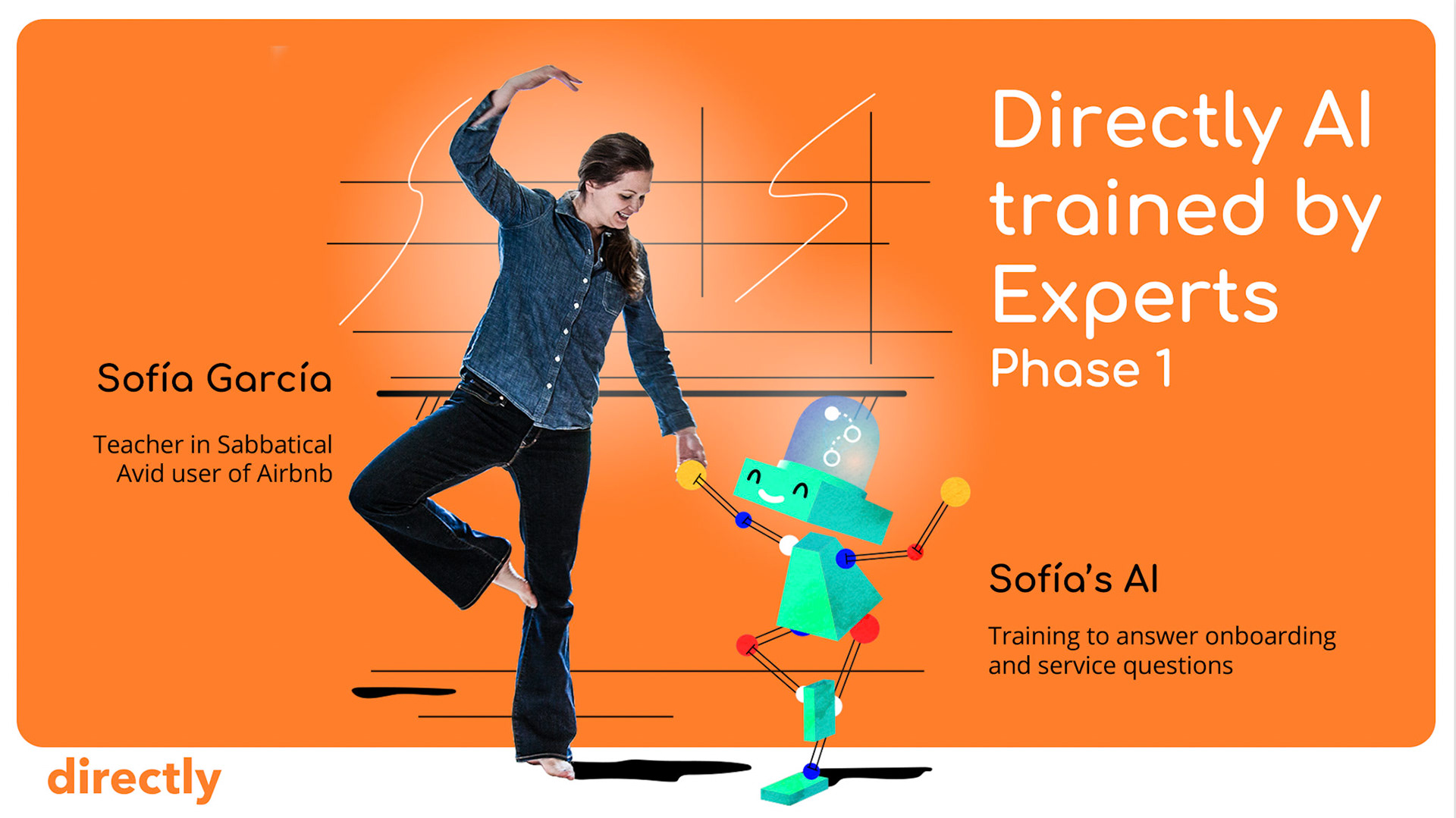
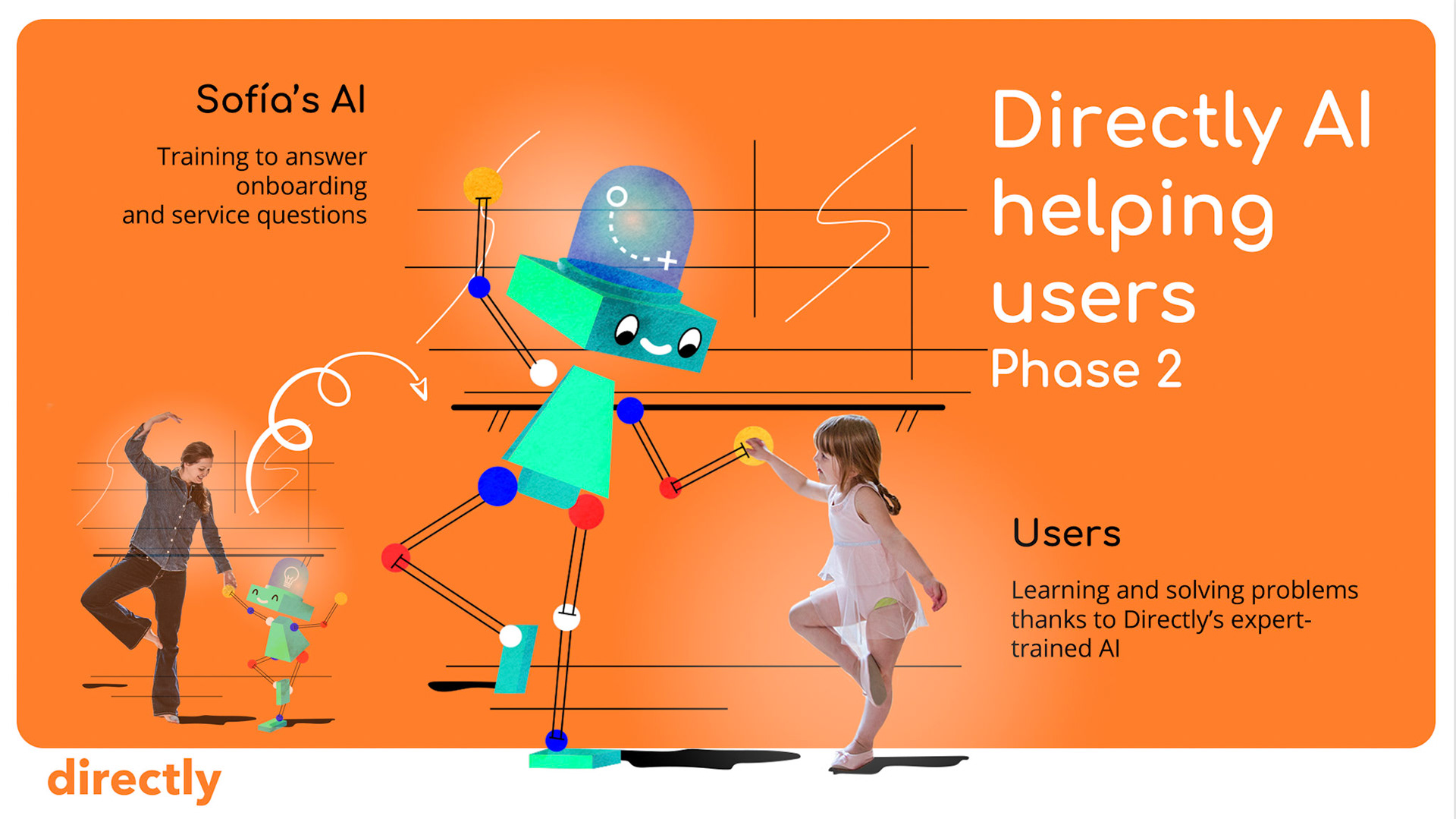
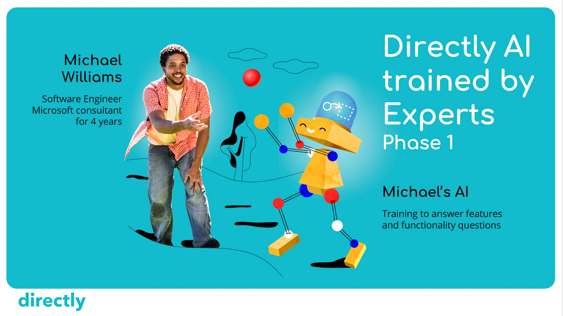
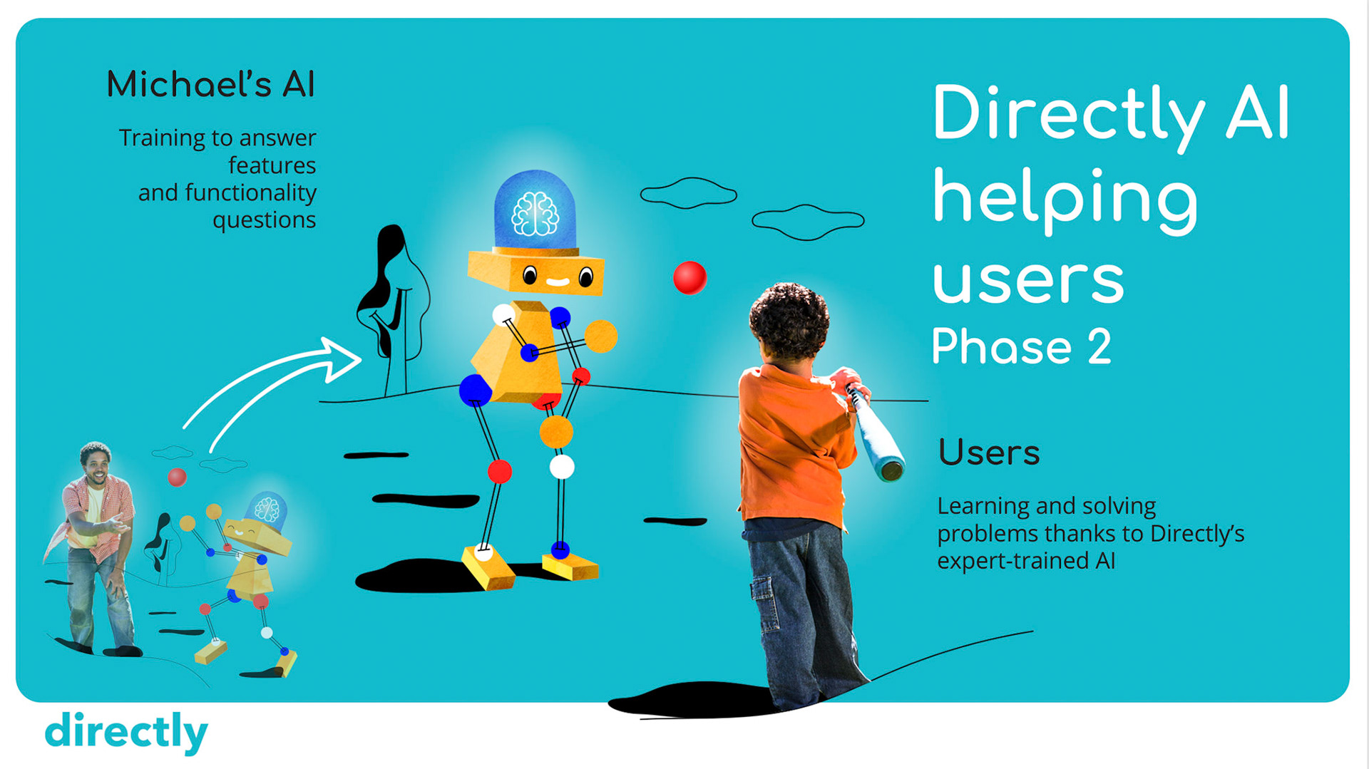
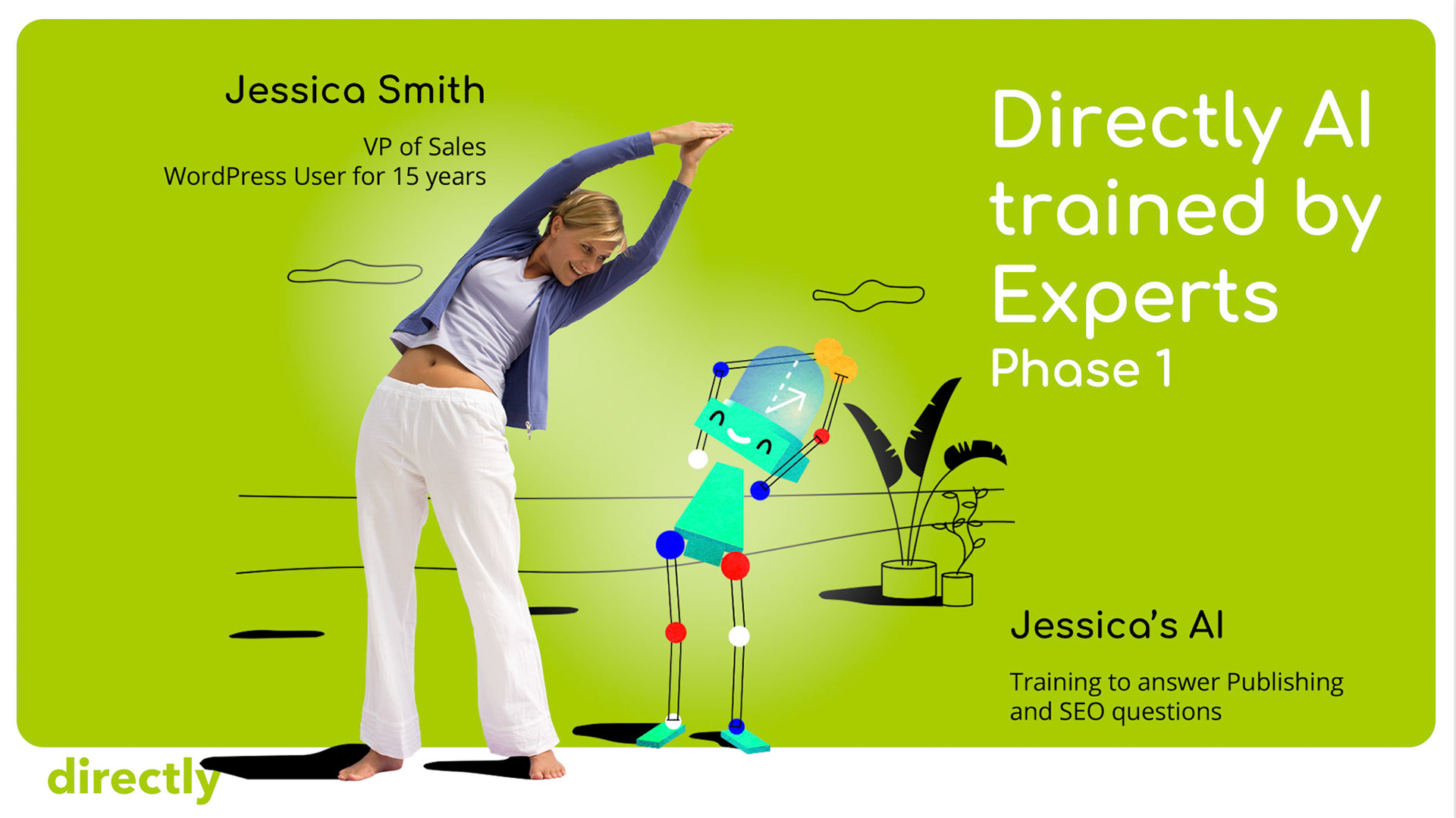
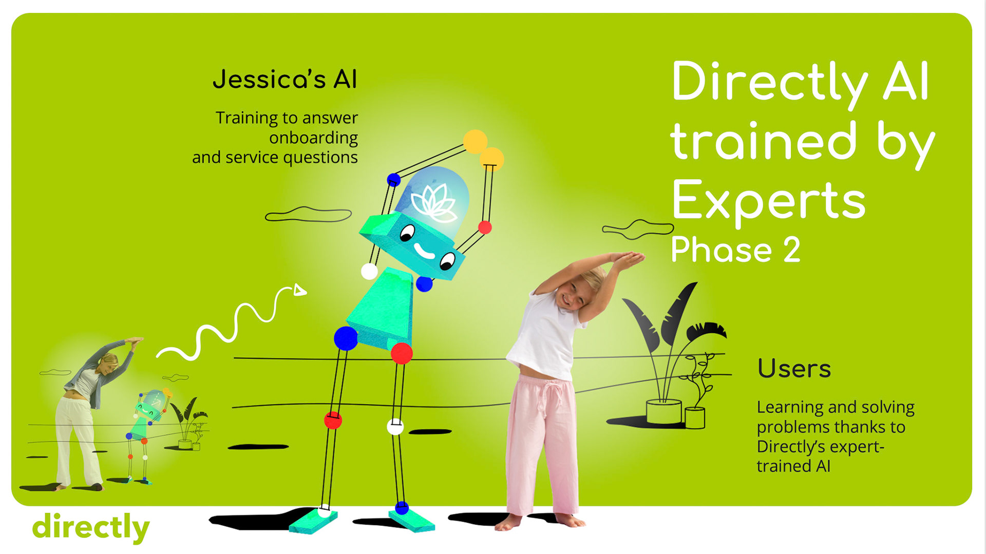
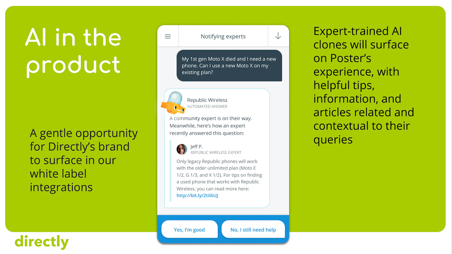
Domo was introduced as an avatar next to the AI-driven prompts of our conversation UX... We crafted a range of moods, or expressions, to appear more personable, nuanced, and legible in its interactions with end-users.
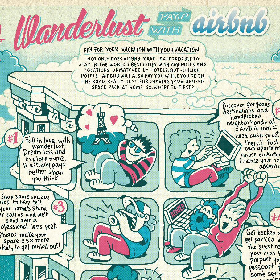
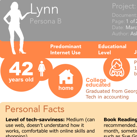
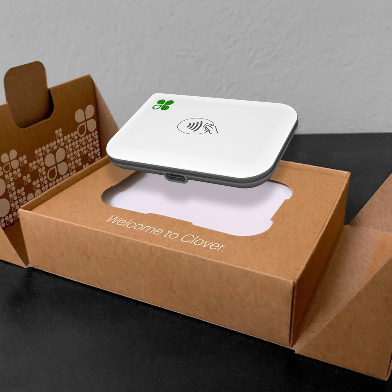
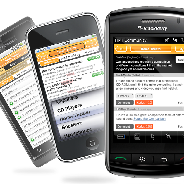
Although we relied on stock photography for much of the concept development (samples above) … we also worked with Paige Green for custom studio photography (last row on the bottom).
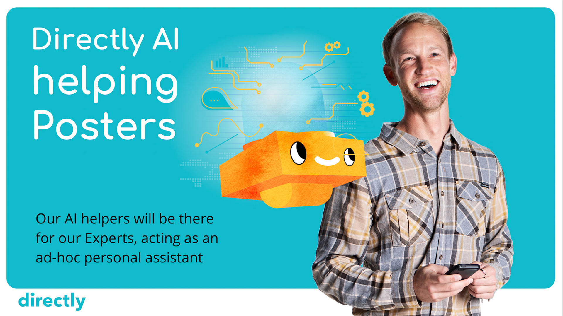
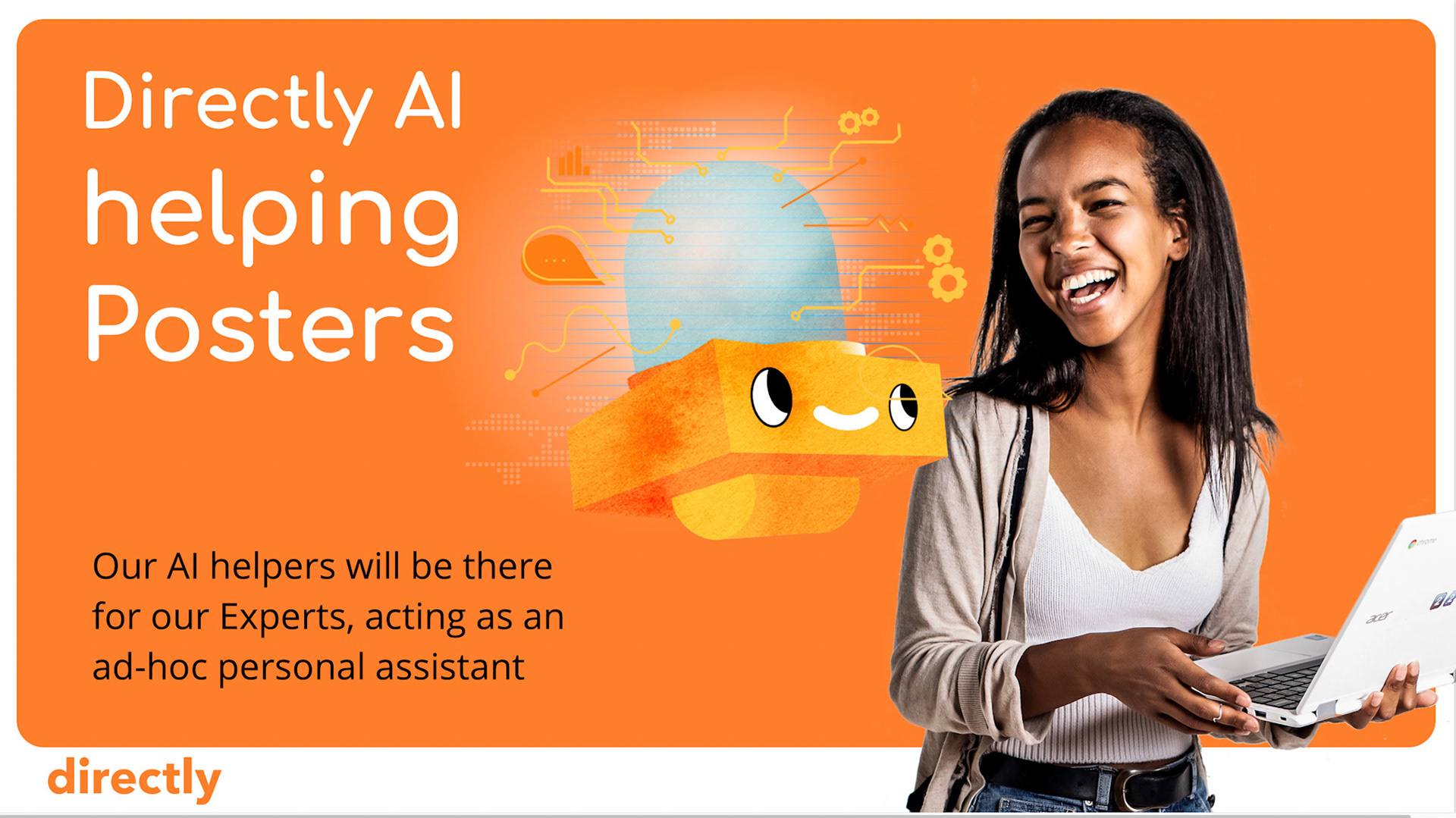
This whimsical storytelling was a great vehicle to stand out in the crowded space of AI companies emerging in 2018… Our material soon started adopting colors and themes.
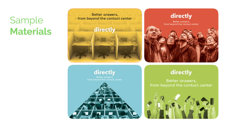
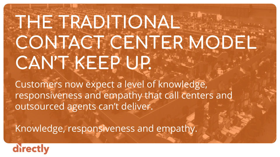
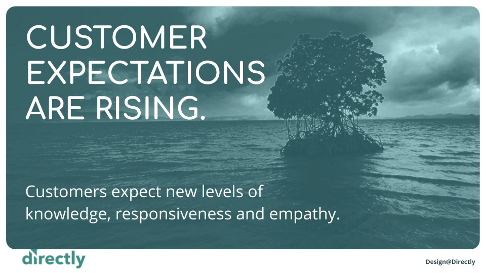
But not long after, we got to experience the agile philosophy of “fail fast”…
Soon after our first conversation with early clients and potential investors, we knew the truly compelling (and differentiated story) was indeed the people behind the technology (expert-in-the-loop) yet framed with the ultimate goal of automated consumer experiences (CX). More than people helping people, the interest turned to people training AI. We knew we had to tweak our messaging (and therefore, our visual narrative)… Intrigued by where we landed? See project Directly Brand 2019
